I joined this startup initially as their sole designer to begin first drafts on creating this planner. As the project grew, I eventually became the lead designer to a small team while working with the CEO to define the future project scope. During my time here, I grew this planner from an idea to a working site with over 400 current users. This planner aims to remove the hassle of creating an academic plan by providing a single hub of information for students to use as they plan out their courses.
1. Create a streamlined, all in one place for new and transfer students to plan courses.
2. Planners are personalized to each user, reducing the mental work each user extends.
3. Market this project to hopefully reach usage in universities beyond UCSD.
Creating YourYear from the ground up was a challenging yet rewarding journey that involved transforming an abstract concept into a tangible and enduring product. My role evolved along with the stages of the product, starting as a UX designer in its prototype stages and eventually becoming a lead and marketing role as the product launched for public use. Successfully meeting its objective, YourYear remains in active use today with over 400 users, showcasing the project's sustained impact. My growth was marked by a hands-on, self-taught approach in three key areas: UX Design, Project Management, and Marketing.
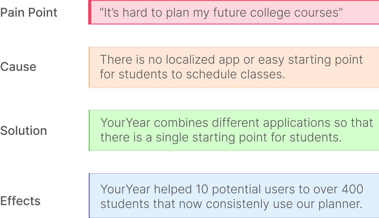
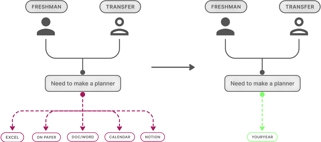
New and senior students already face many obstacles on their way to graduation. Both from personal experience as well as word of mouth from peers, we've gleaned that making a four year class plan - one that is essential to graduation - is almost always pushed off by students. Furthermore, on a survey sent out prior to my joining, 100 UCSD students were asked about things that would make creating academic plans easier as well as their current processes. Based on responses, our proposed solution would cover almost 80% of respondent needs.
" [Static plans] cause me to redo my whole academic plan each quarter...it feels like I’m never gonna get out of here..." - Laura C.
TLDR, there is no comprehensive place for students to start planning courses.
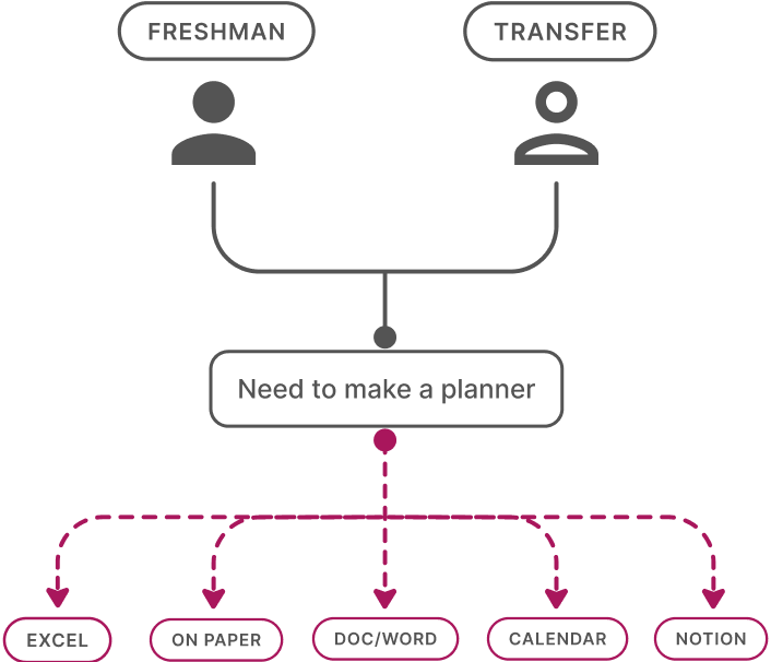
Making a four year plan is often overwhelming - new college students need a streamlined process that helps them create an overview of their upcoming years. Though the provided, static four year plans are a good jumping off point, students are on their own in creating a personalized plan to take with them throughout college. They scatter to excel, docs, paper - anywhere they can throw down ideas and change as their university plans change. Some don’t even have a plan and face the consequences later.
How can I turn this sketch into a tangible product?
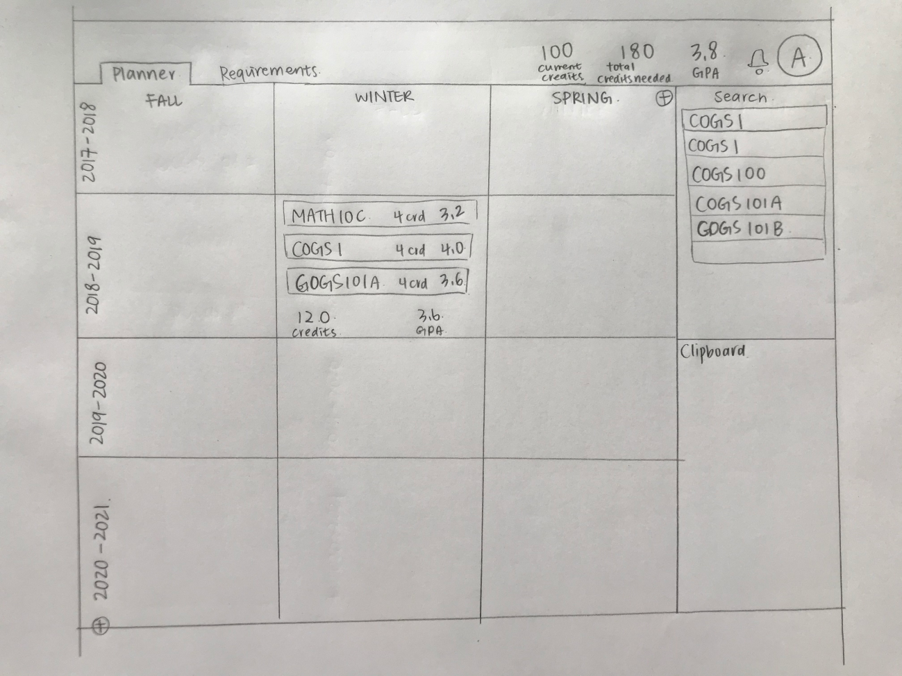
When I first joined YourYear, this paper sketch was the vision of what the CEO and dev had at the time. In order to turn this sketch into a product, there were a few things I wanted to get in order first: what features will be included in the minimum viable product (MVP), and what visual direction did we want to take this in? Because the main goal so far was to release a beta to user test, I wanted to work towards something with fleshed out features rather than flashy visuals. Narrowing down from a long list of features the CEO wanted to have eventually, we decided on implementing:
1. Interactivity with drag and drop features.
2. A clipboard to "hold" courses.
3. Two views: quarterly and yearly.
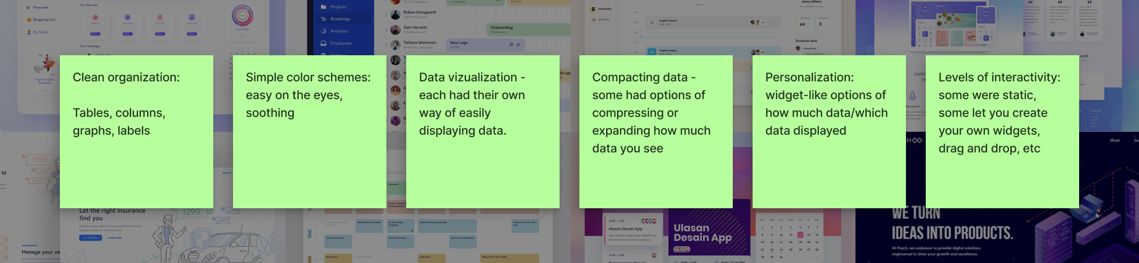
As for visuals, I wanted to get a feel of how similar applications were setting up digital planners - how did they organize time based information? Additionally, how did they keep quantities of information clean, easy to sort, and easy on the user? I analyzed related applications and noted stand out or most helpful features.
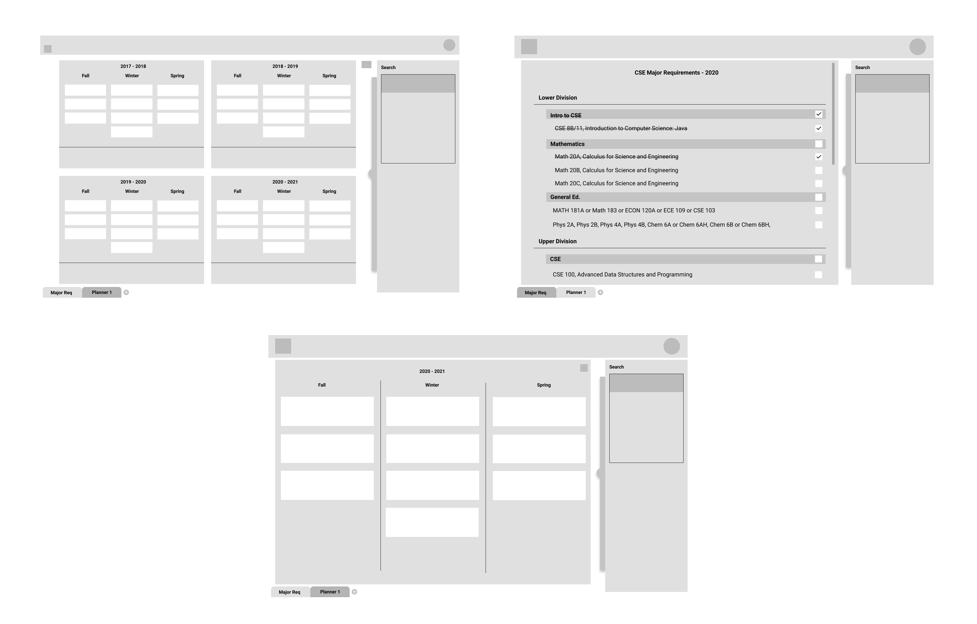
An information map is needed before wireframing.
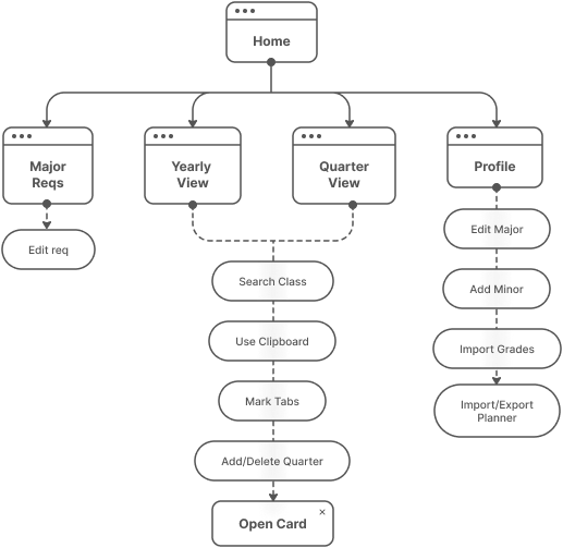
With three main features to focus on, I still needed to get a lay of the land: how big will the site itself be? We initially started with many features and whittled it down to three core ones, but there needed to be space to implement futures ones. I consulted the CEO for project scope and created a tentative information architecture diagram including all the features he foresaw being added. This also benefitted the dev team as it acted as a guide to ensure feasibility with a small team.
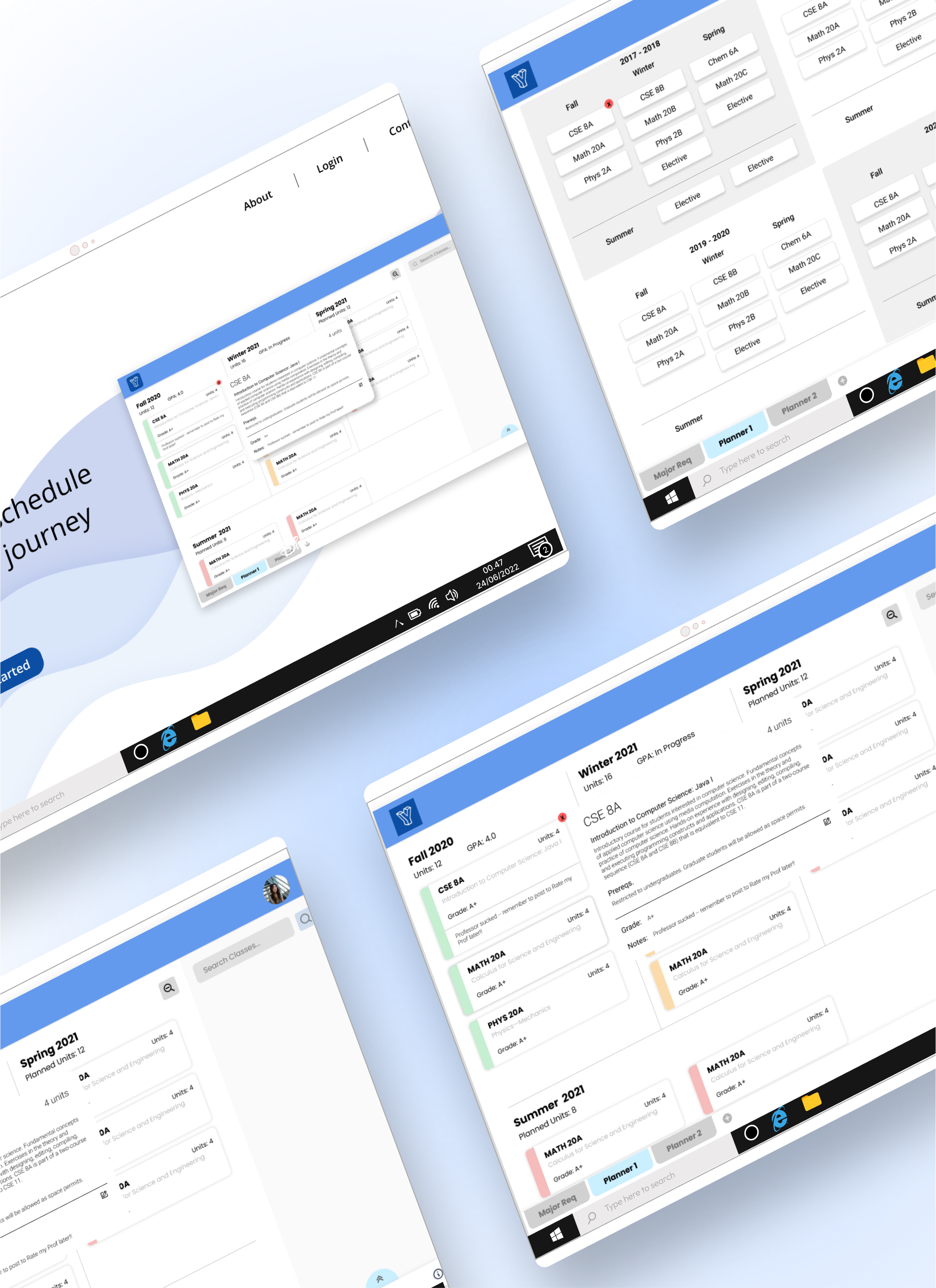
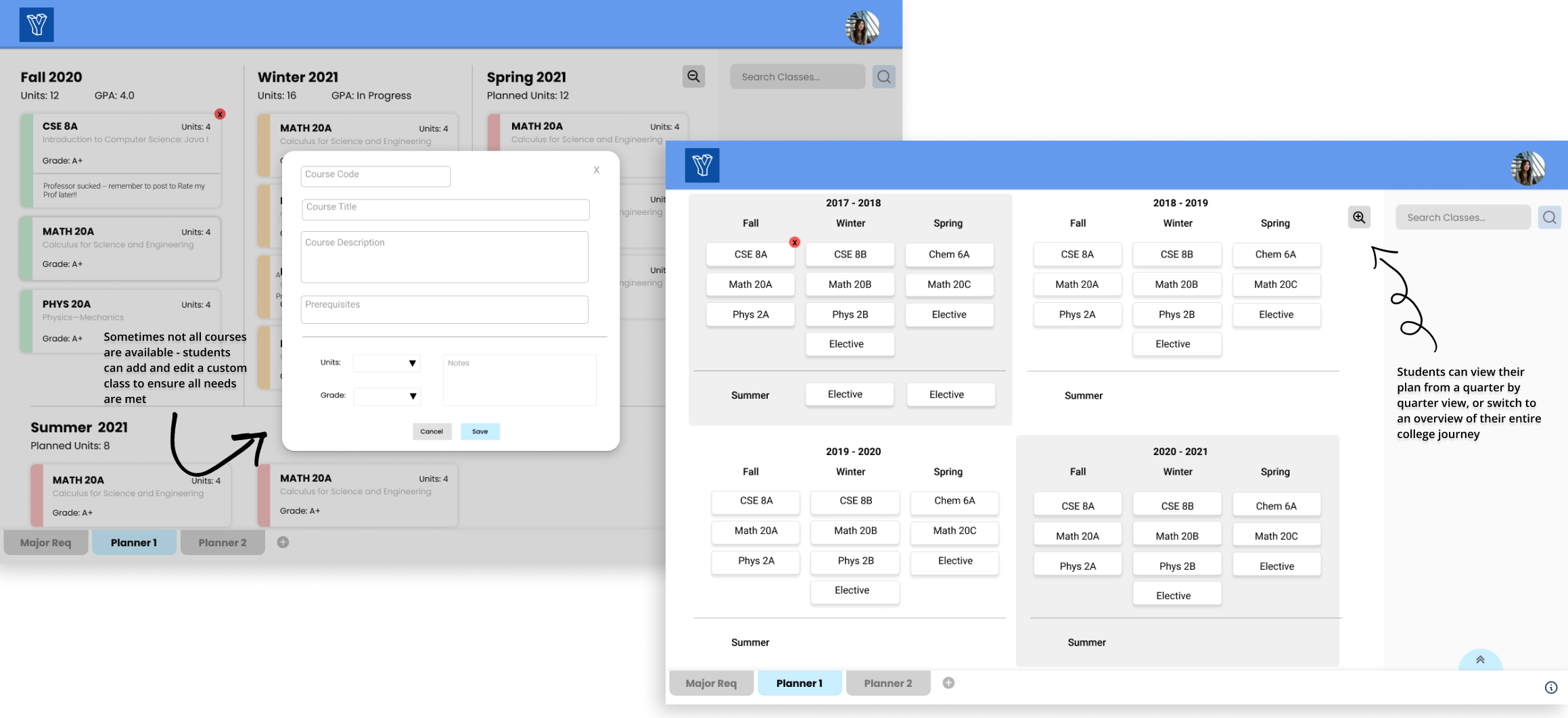
With the main features in mind and visual styles down, I started a simple grayscale wireframe to get all our ideas down "onto paper". The main screen has a semester or quarterly view with classes students are planning to take. The user can click a button to zoom out into a yearly view which gives an overview of all the classes planned that year. On the side is a panel containing the search and clipboard - users can search for classes in the school system and drag them into their planner or on hold in the clipboard.
At the bottom, there is a tab to look at their major requirements which users can upload. As they drag their classes into the planner, the classes they are required to take will check off automatically.
At this point in the project, two more designers were onboarded to help flesh out an interactive prototype we can use to test. I was moved into the lead designer position and worked more closely with the CEO and dev team to ensure the designs were feasible. As we were working on this iteration, some features were added or removed.
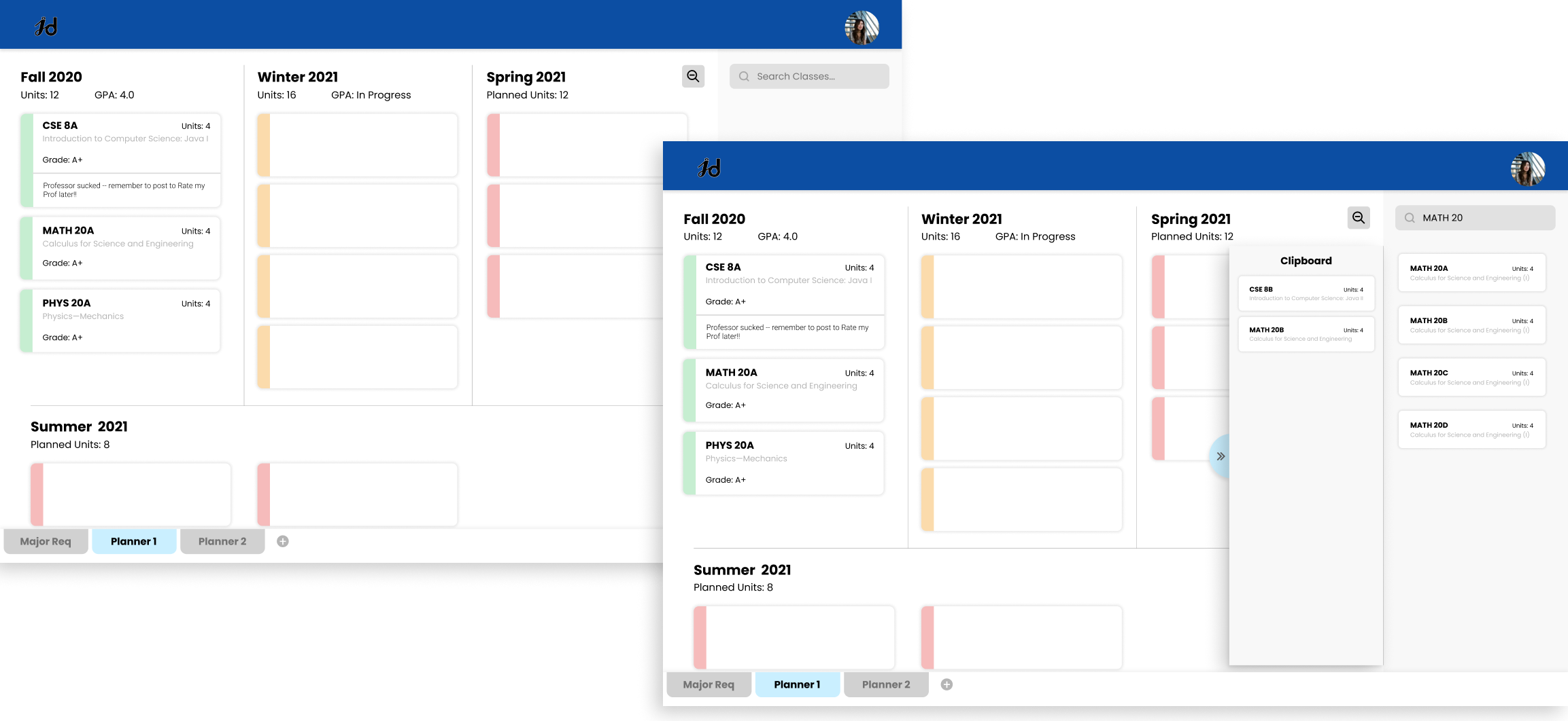
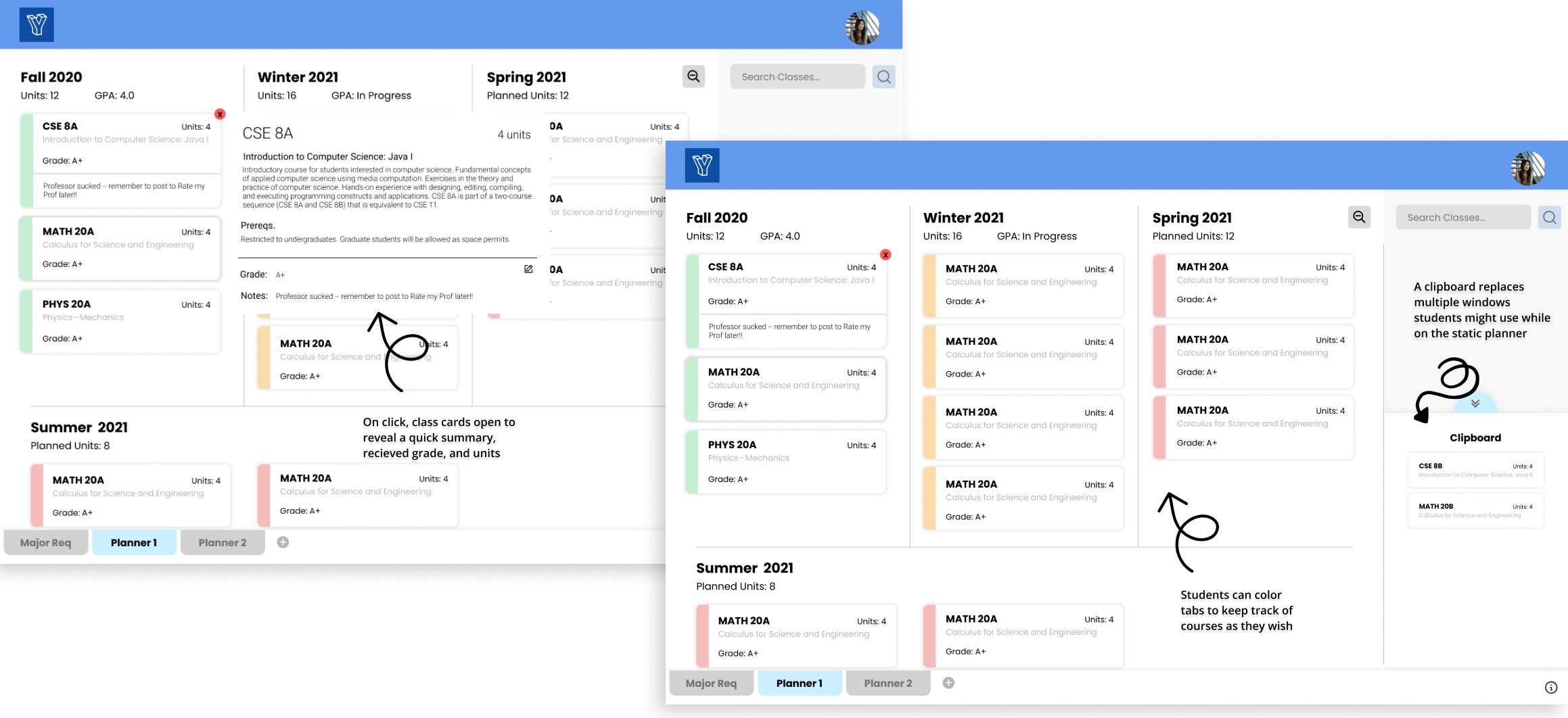
Our home screen takes the user to the quarterly view of their planner. Classes can be searched and dragged in as small cards with details on the course. The clipboard feature will slide out on hover and users can drop their classes in there to be held for later. At the bottom, users can create more planners or view their major requirements. Tabs were also added in to the left of class cards to let users organize by color.
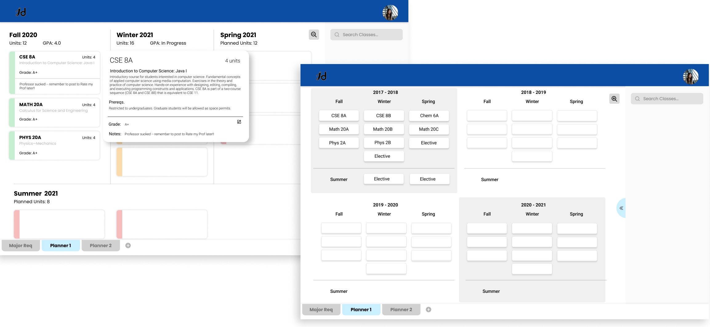
A new feature we added in were expanded and condensed cards. Upon clicking on a class card, it will expand with more information on the class as well as the grade the user received in previous courses. On the right is the four year view, allowing users a top down view on all classes they'll take during their college career. Here, class information is fully condensed.
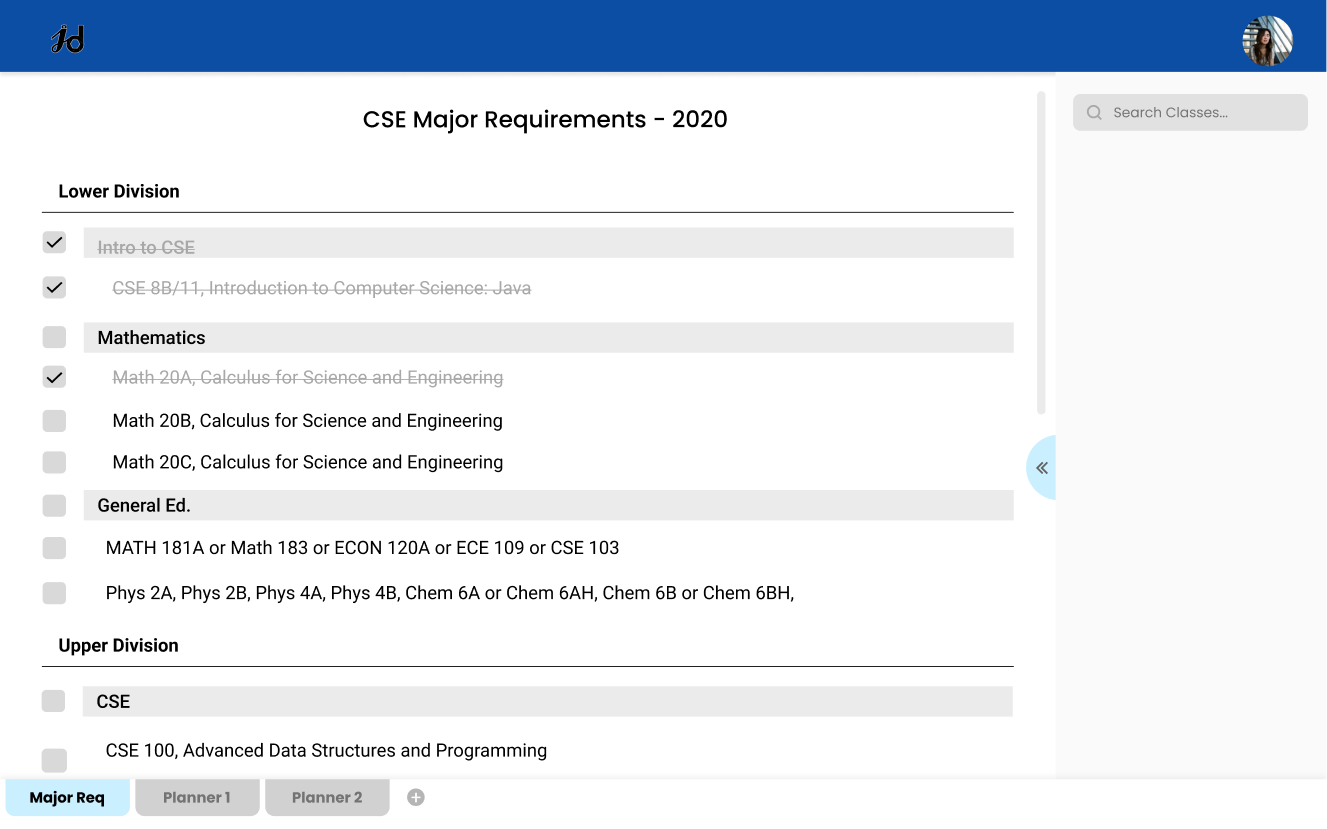
Another feature we included was a major requirements checklist that would be individualized to each student - done by linking their school canvas account. This would automatically sync and cross off classes they completed, and suggest classes they have yet to take.
Getting real feedback from students.
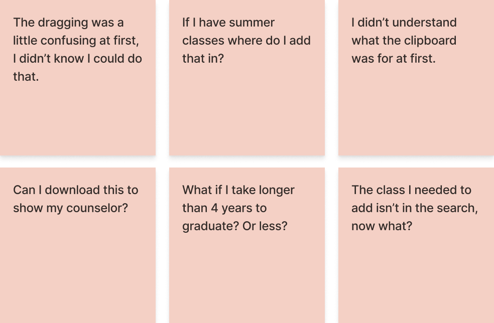
Now that the interactive prototype was ready to be beta tested, we recruited 50 students to test our product. We had them explore the planner themselves, then gave them a set task of creating a one year plan for a programming student, given the major requirements. While there were no major hiccups for any students, the most notable remarks/questions were jotted down above.
Creating a home for YourYear.
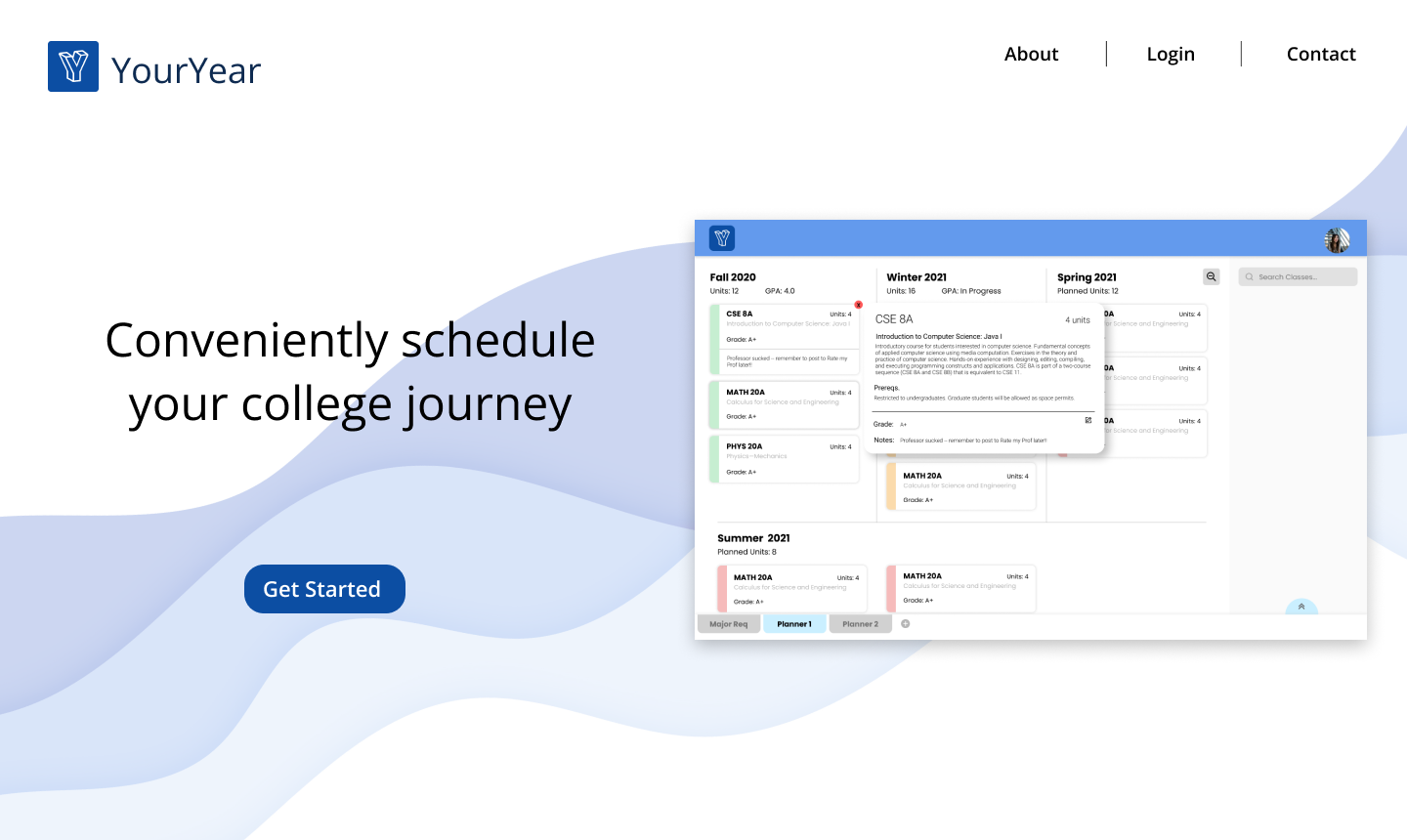
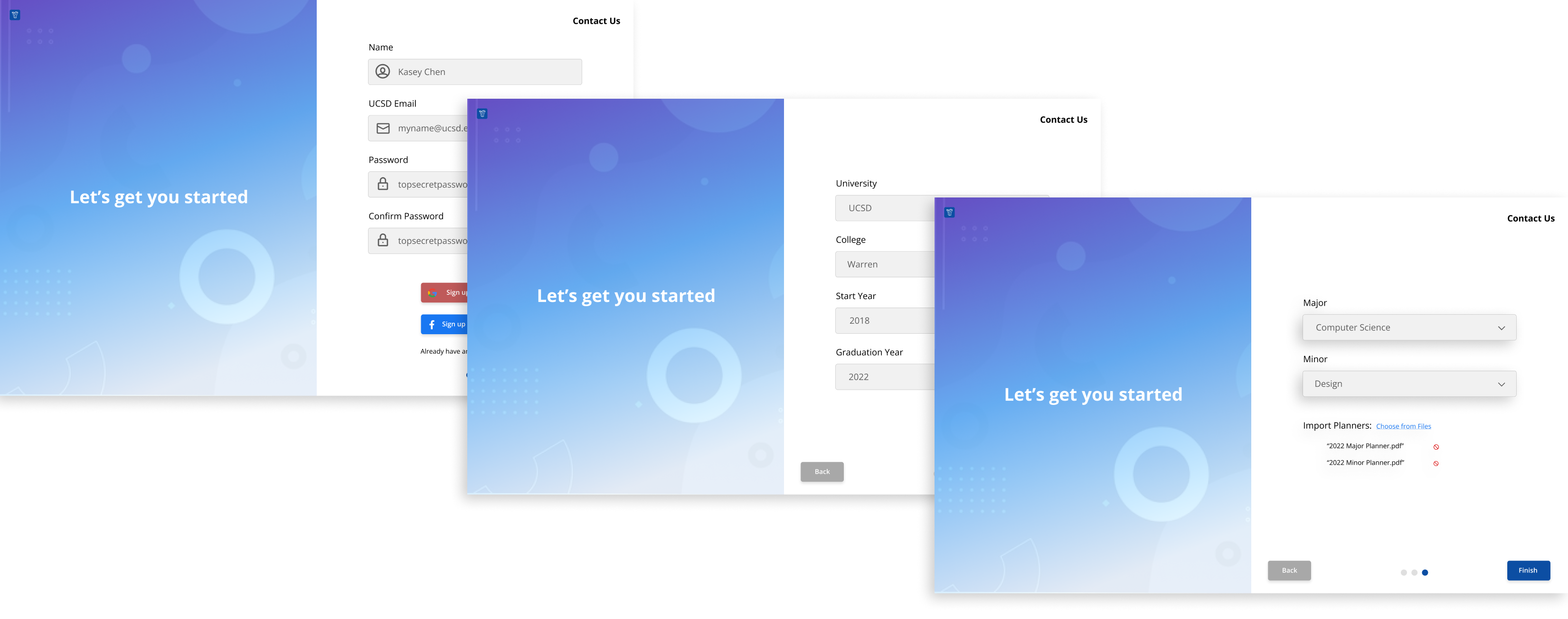
As the dev team was working on bringing the interactive prototype to life, I worked with my team to create a website to house YourYear. This was a fairly straightforward process as we only needed a handful of pages: home and a sign up/login sequence. For the home screen, we embedded a gif of the planner and a call to action for signing up. The sign up sequence was simple and we based it off existing sites, allowing users to create a profile and import planners if they had existing ones.
YourYear was successfully launched during the summer of 2021, coinciding with the start of the new school year. After the initial launch, all designers and devs worked to market this planner in the classes and orgs they were in, and through word of mouth between friends. I helped with social media campaigns and marketing on campus websites.
What was the outcome of this?
Bringing YourYear to life from scratch was no easy feat, as I spent many hours first turning a sketch and an idea into a tangible product, then working to market it and ensure a life span even beyond when I leave this project. In terms of meeting it's goal, I think we were successful in doing so as this continues to be used today. As for my personal growth, I had a very hands on, self taught approach in three fields:
UX DESIGN. With this being my main background, this project was great technical practice in end to end design: working on sketches, wireframing, prototyping, to user testing and interviewing.
PROJECT MANAGEMENT. Though I didn't intend to become a visual design lead here, I actually found it to be a great learning experience on how to coordinate within and between teams. I also worked plenty on project scope and timelines with the CEO and CTO.
MARKETING. As a culmination of the end stretch of the planner, we all gained marketing skills as we pitched YourYear across campus and social media to (hopefully) ease the burden of all students!