As the sole UX designer in this project, I crafted a mobile app from the ground up, addressing pain points related to extended turnaround times and misplaced paperwork. I collaborated with the engineering team and project manager to establish timelines, assess product feasibility, and engage in discussions with management to define the product scope and features to be built.
View product site here
1. Digitize a manual, paperwork process by converting physical forms to a mobile app.
2. Solve existing issues of data loss and prolonged inspection turnaround times.
3. Learn how to manage my work and clients as the sole UX designer.
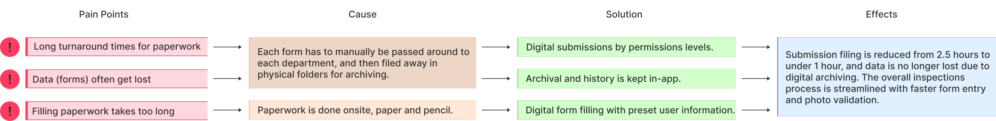
In this project, I spearheaded the creation of a mobile app from scratch for a janitorial services company overseeing operations across the Bay Area. As the designer on the team, I navigated the complete UX design journey to create a product that seamlessly balances aesthetics with efficiency. The main goal was to streamline ticket/submission processes and empower staff by digitizing the traditional paperwork process. The impact of my efforts is evident in the 1.5-hour daily reduction in turnaround times, and the complete elimination of lost paperwork by having a digital archive system.

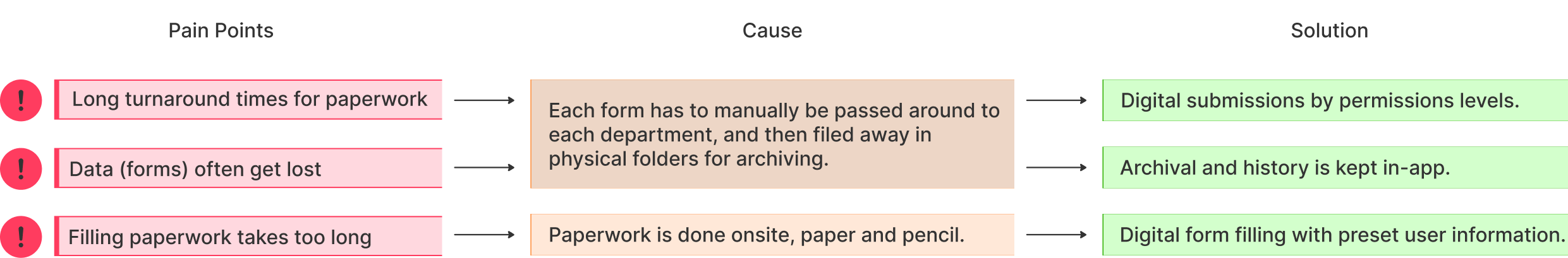
In response to the evolving landscape of business operations, SWA Services management looked to modernize and streamline their site inspection workflows by leveraging digital solutions. This was pushed for after a realization that manual workflows were time-consuming, prone to information loss, and generated unnecessary administrative overhead. In this digital age where almost everyone owns a smartphone, SWA proposed to replace these antiquated processes with a single mobile app to enhance the speed of inspections and allow better communications between parties.
With this context in mind, I summarized a problem statement to capture the goal of this project. This statement would then serve as a guide as I think through the design process, but also to aid in conversations with the project manager (PM) and management.
At SWA Services, manual paperwork processes resulted in extended turnaround times, data loss, and excessive administrative involvement, impacting project timelines and customer satisfaction. How can we design a solution to address these issues effectively?
To start off the project, I needed to gather some insights on the team and the submission process. I had a chat with the director of operations and the project manager to better understand both the company's objectives and the user's pain points and preferences.

The company's key goal was to streamline the submission, approval, and viewing process to solve issues like data loss attributed to long turnaround times. When asked for more information about turnaround time, I was given an estimate that each quality inspection is estimated to be 30 minutes daily per work site for 5 different sites leading to a total of 2.5 hours daily.
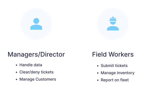
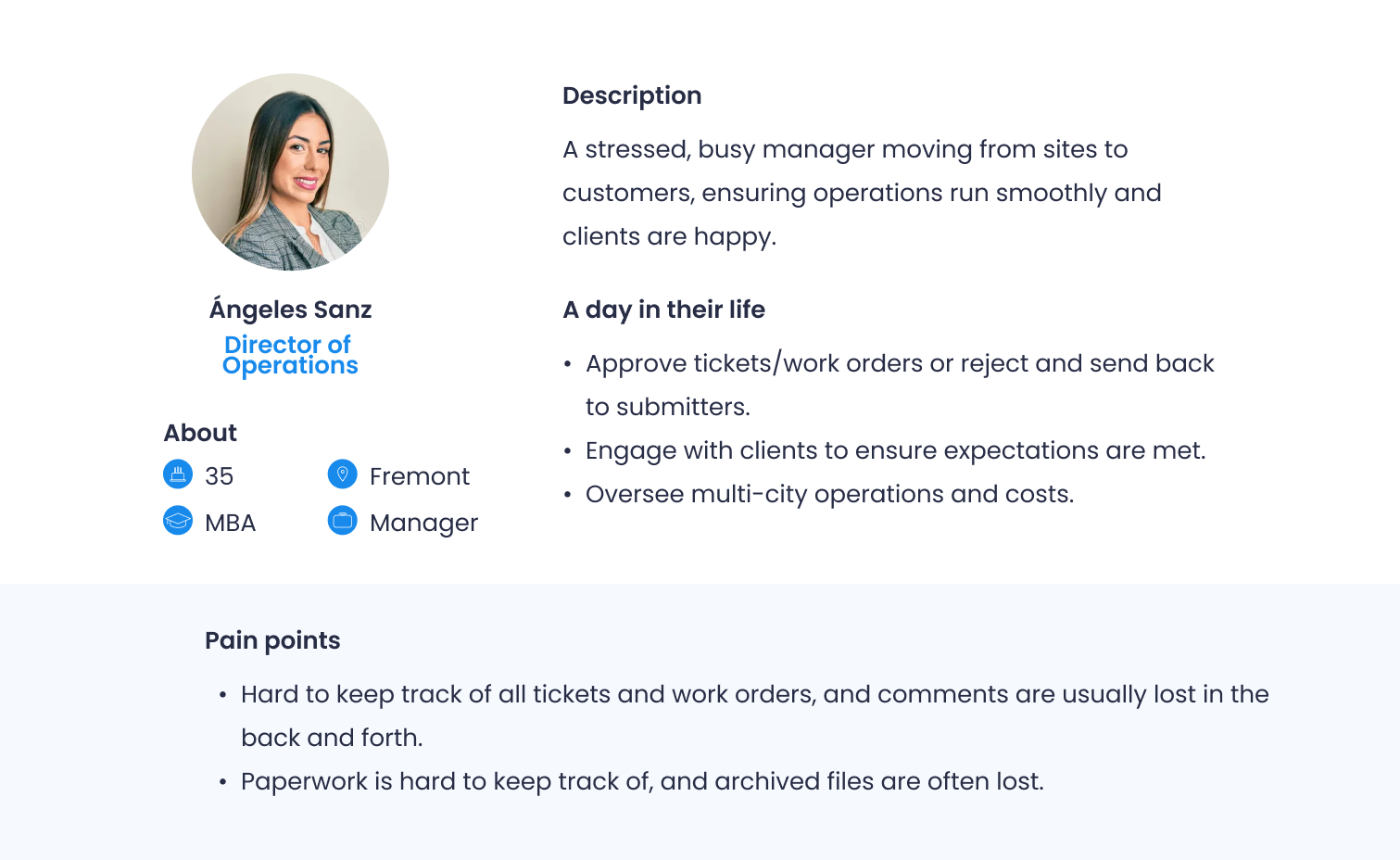
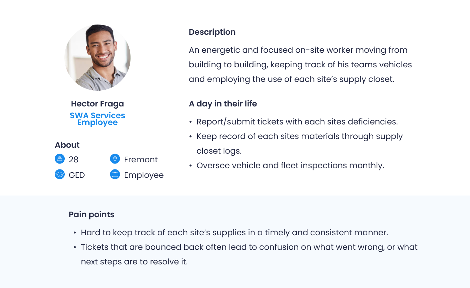
On the staff side, I obtained insights into two user roles: Managers handle data, clear/deny tickets, and engage with multiple customers while field workers and customers use the app for submitting tickets, on-site work, and inventory management.
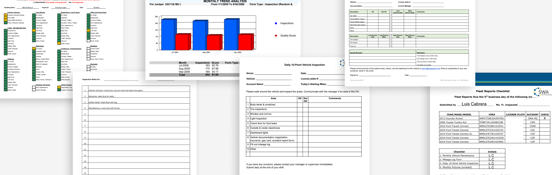
As for the submission process itself, I was sent the various forms and paperwork that the staff had to fill out manually. At a glance, these would help me understand the connection between the problem and the user roles mentioned above.
With the additional information about the future users noted, I created User Personas to aid in meeting with the PM and dev team for next steps. This helps to promote a more empathetic understanding of our future users. Furthermore, these personas help to lead into the next step in my design process as this allows us to prioritize feature requests and requirements. For example, a main pain point of both personas is the inability to keep track of their work orders - thus, prioritizing the design for the ticket submission and checks should be top of mind.
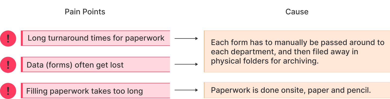
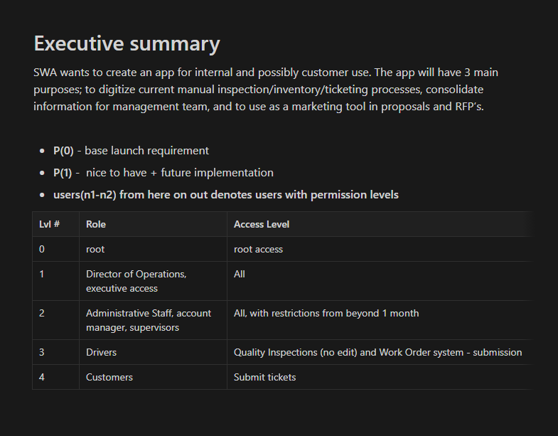
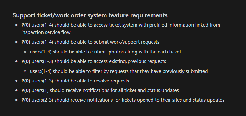
With a deeper understanding of future users through personas, the engineering team and I met to brainstorm the core causations of these pain points. This led to a feature document outlining the app's desired elements and constraints. The app would feature different flows based on users' permissions within the company's hierarchy: Director of Ops, Administrative Staff, Account Managers/Supervisors, and finally, Drivers and Customers.
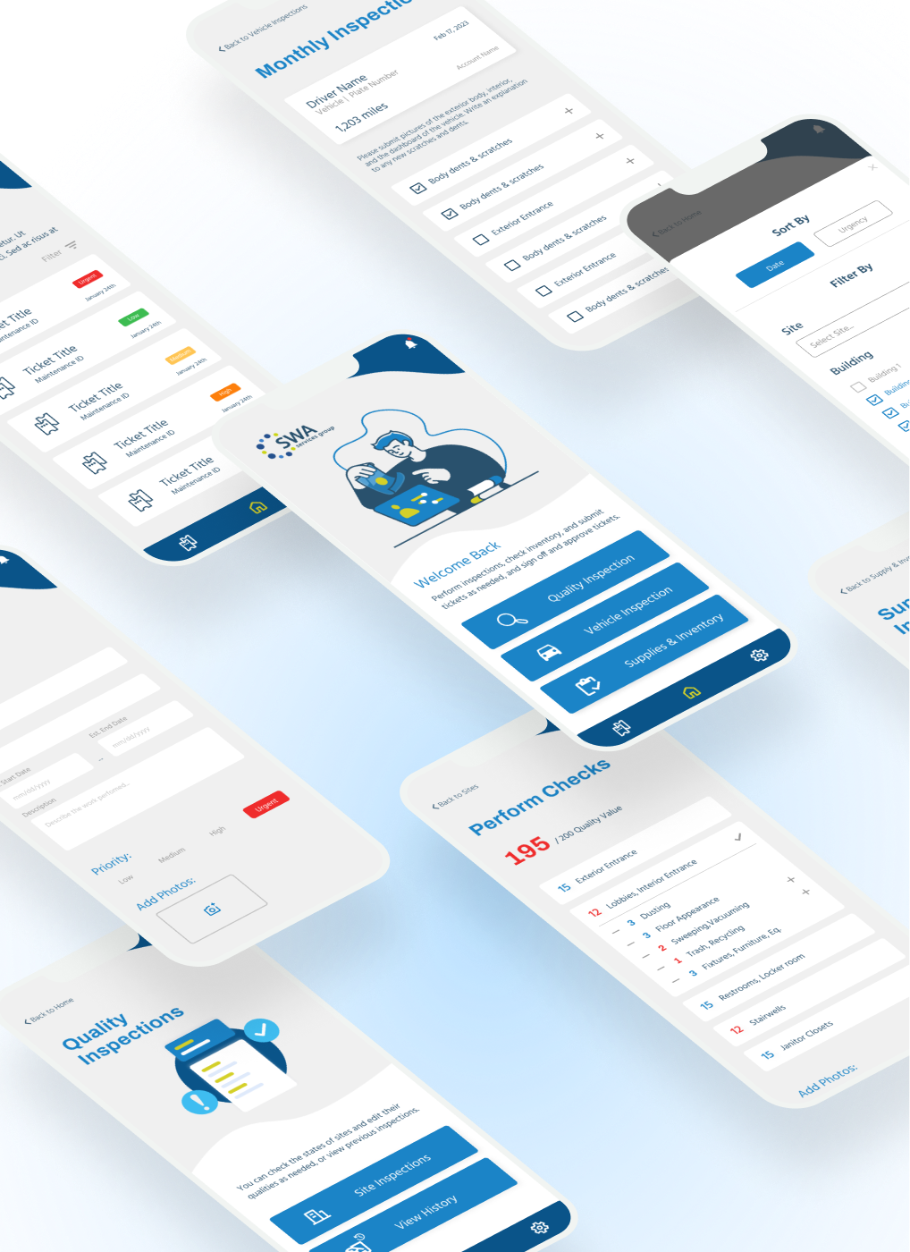
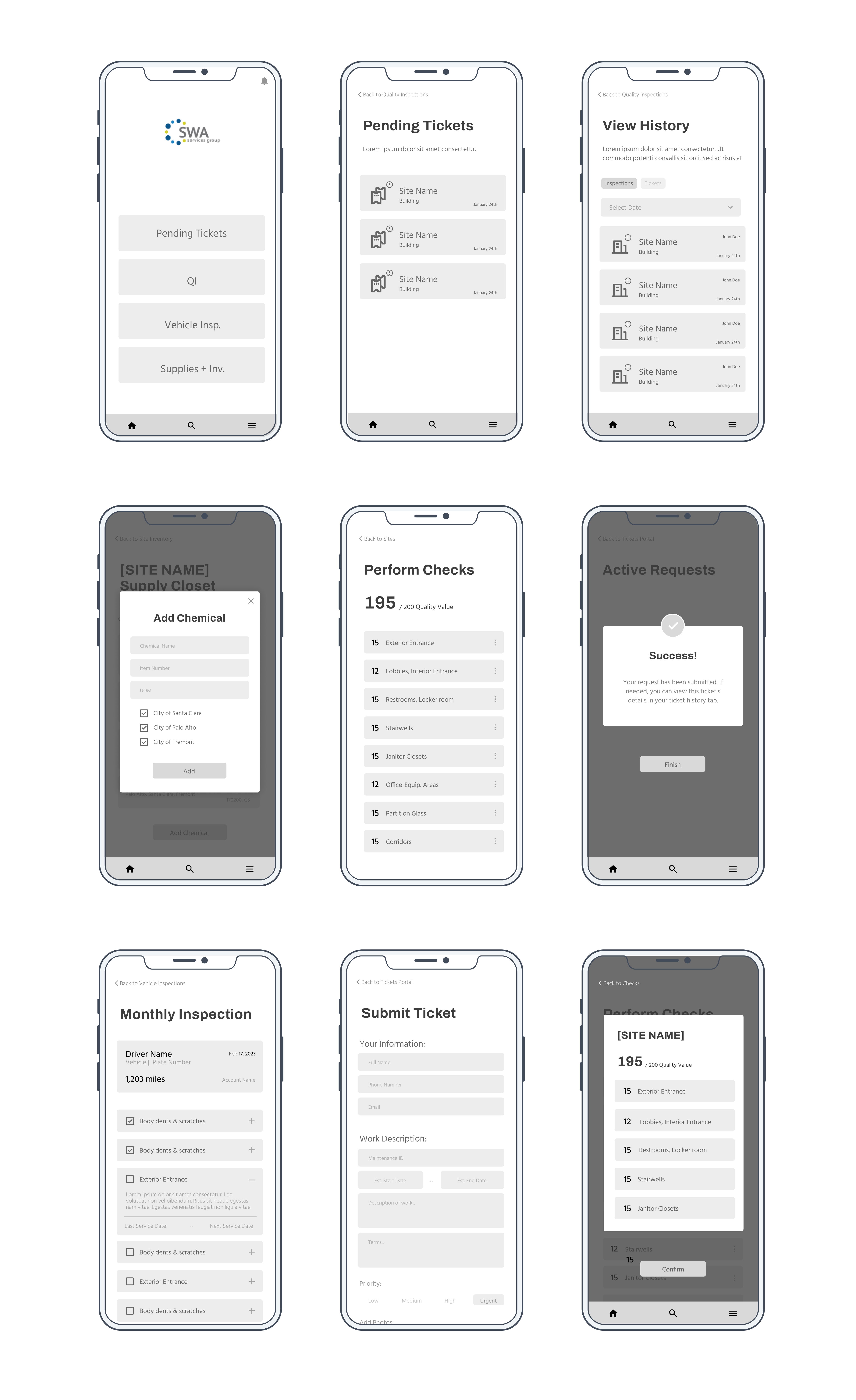
As for the features themselves, these were derived from each type of form the staff had to fill out in a typical week: Quality Inspections, Vehicle Inspections, Supplies & Inventory, and most importantly, the Work Order system. I translated these notes from notion over into design-iterable notes as seen below.
Due to varying permission levels, immediately going into wireframing was challenging (and honestly, not a good idea if we’re following the UX design process). I prioritized creating the highest-level app flow encompassing all permission levels, then removing flows for lower levels. To think through this, I worked directly with the project manager to understand the end to end submission process for each form. In turn, I was able to map each physical step into a digital version. This was especially important because maintaining consistency between the digital and manual processes will ensure the smallest learning curve possible, thus saving time and maximizing efficiency.
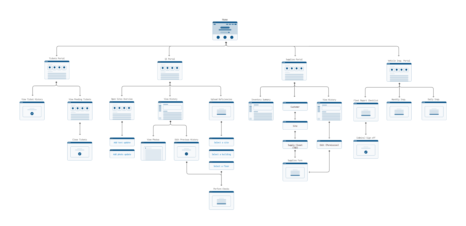
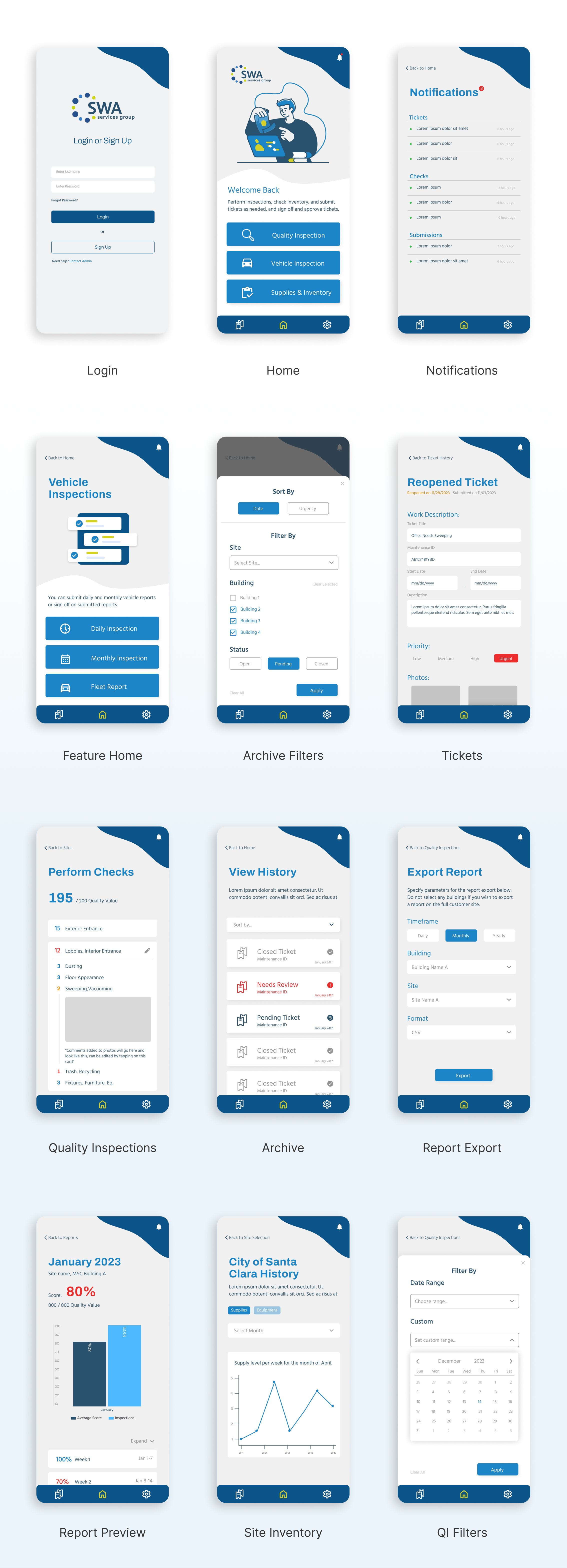
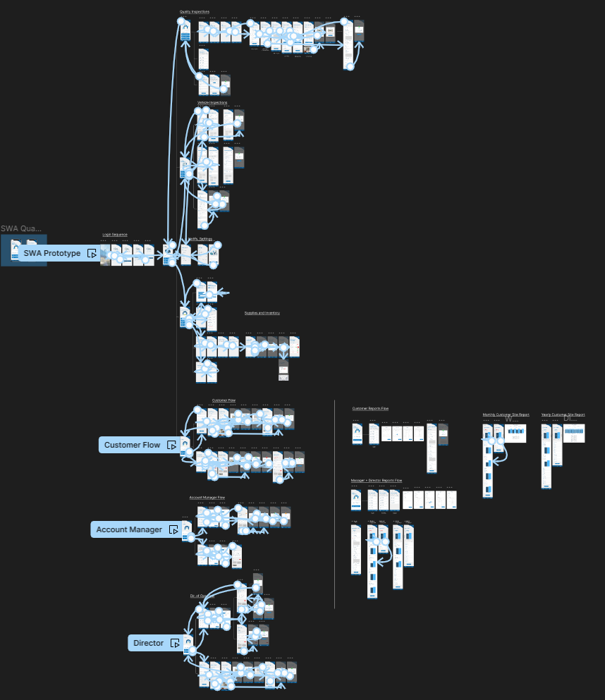
A mapping of the app functionalties
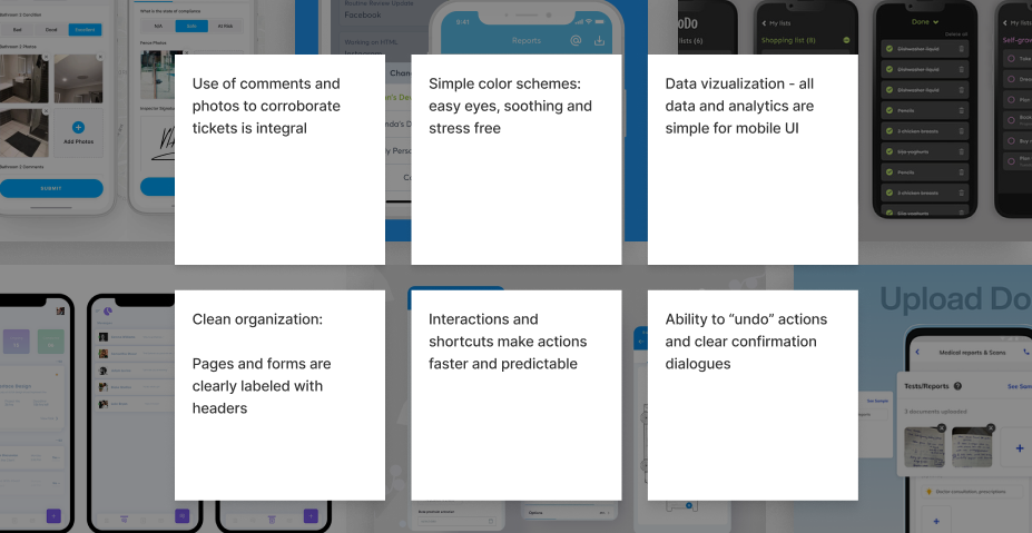
With the app user flows completed, it was time to brainstorm the first iteration of wireframes. However, before diving in, I needed additional information on the UI side - given my lack of experience in designing service/report apps, I wanted to give it some extra consideration. I aimed to stick to UX heuristics: aligning with real-world language and industry standards. Since I wasn't familiar with these, I looked into competitors in the same market. Specifically, I looked at the flows for ticket submission, photo submissions, mobile checklists, and report exporting.
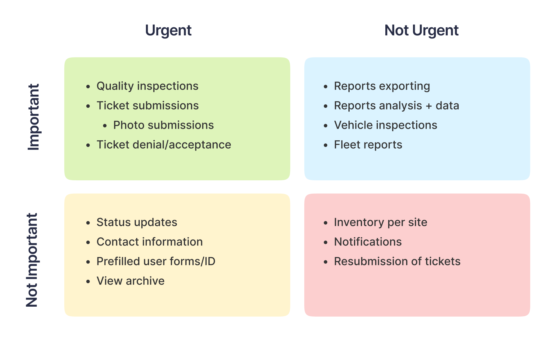
At the same time, I worked with the PM and prioritized tasks by creating an Eisen Hover matrix for a clear visual representation of the features at hand. This helped both the engineering team and I to set a priority list as well as touch back with the company on timelines and scope.
Now that I had a wealth of research and resources behind me, I delved into designing the app's visuals. Prioritizing simplicity and user flow, I began with grayscale iterations, focusing on key elements like action buttons and large interactions to connect the flows.
After completing the wireframes, I got approval from the PM to proceed to the first iteration of color prototypes. Aligning with the SWA website branding themes of Clean, Safe, and Efficient, I designed colors and details for the initial design. I utilized Figma’s Auto Layout feature to ensure pixel perfect alignment and attention to grids - this ensured the clean, minimalistic look and feel of the app as well as made it easier to hand off for engineering.
An example of the grid system used
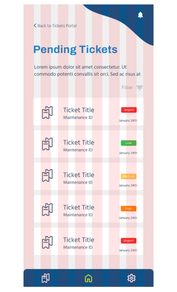
This is where the majority of my work was focused, since it directly addressed our main problem: the challenge of keeping track of work orders efficiently, and the need for a quicker method of communicating changes. With this set of features, I incorporated three sub-features: site and check inspection, a history of archived tickets, and a report generator. This allows users to quickly fill out or reject checks, access all previous submissions , and generate reports with analytical breakdowns for their customers.
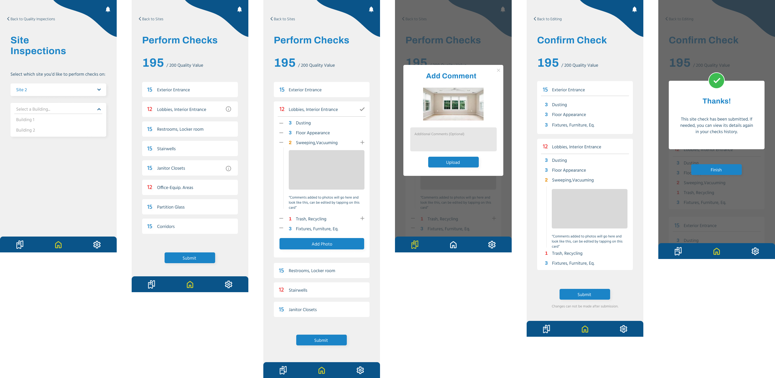
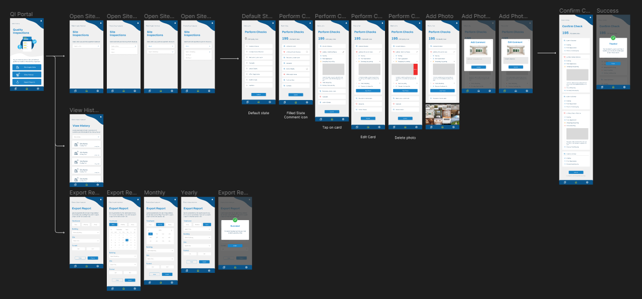
The typical flow for a quality inspection check submission
As for the reports, they were designed to offer two views: mobile previews and PDF exports, providing an overview of data within selected date ranges. This includes the total scoring of an area compared to the average actual scores, offering managers and directors a quick, at-a-glance update when they need to make quick decisions. It also offers customers an additional perspective on the quality of services provided by SWA.
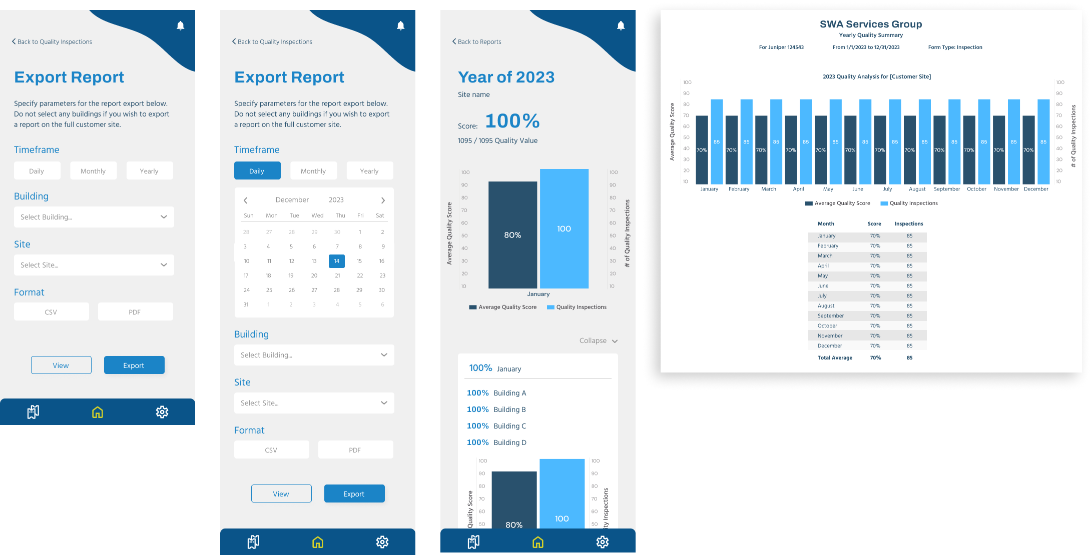
Reports and pdfs for swa and customer use
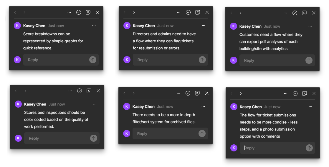
Before starting version 2 iterations, I touched base with the PM and SWA managers to confirm we were on the right track. To generalize their feedback, here were a few points that needed to be updated in the next iteration:
After addressing these comments, I started the process of refining smaller details in the app, including images, icons, mobile interactions, and copywriting for each placeholder section. Revisiting UX heuristics, I applied principles such as memory recall, consistency, and predictable interactions to lend to a smoothly working app. At this stage, I also consolidated all screens and flows into one interconnected app flow to review the submission process. This visual aid was used to discuss tasks with the engineering team and ensuring the flows I made are feasible on the back end side.
With the hi-fi prototypes completed, it was time for me to check if this is truly the right solution by referring back to the project scope created earlier. Prompted by questions about flow and interactivity, I created an interactive prototype to better showcase the app. This not only clarified micro-interactions like drop-downs, clicks, or drags to the engineering team but also let management test and confirm the intended functionality.
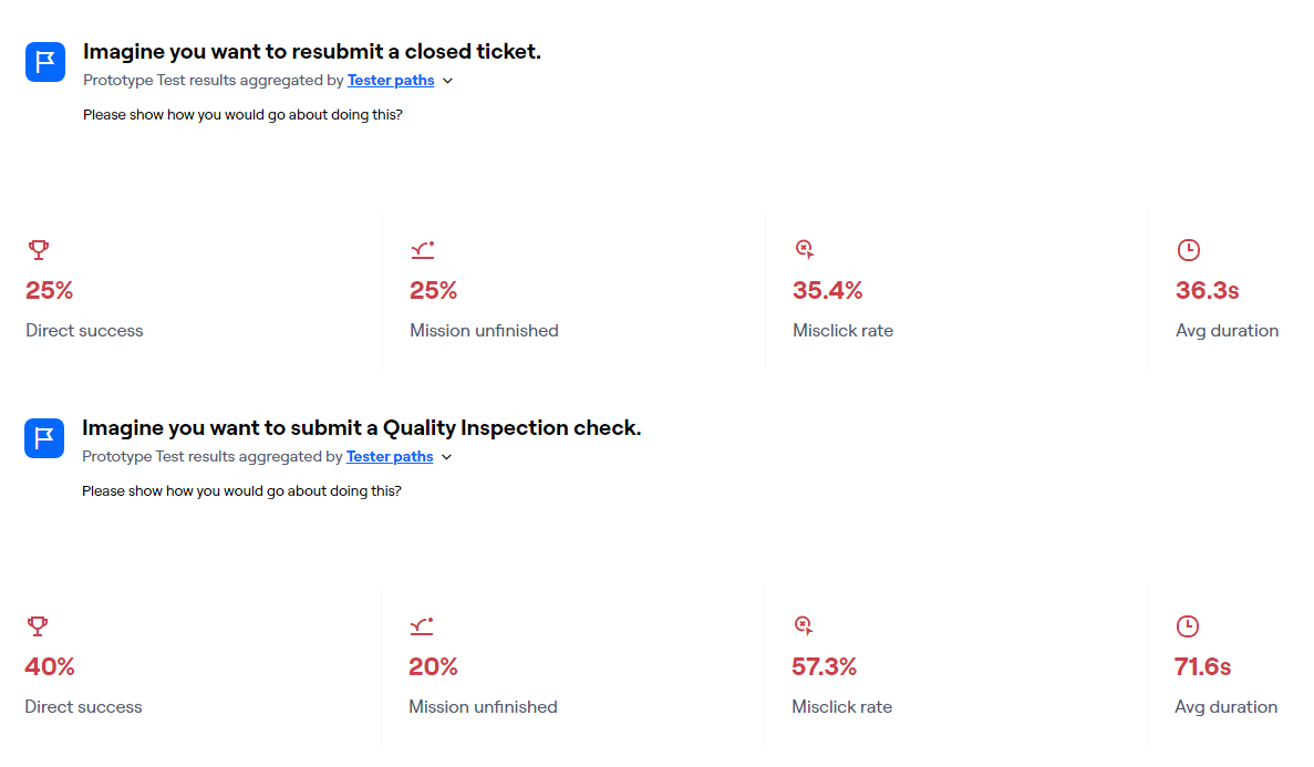
Now that I had a functional prototype, I conducted user tests using Maze. I set up two tasks for the tester: submitting an inspection and viewing an old inspection. Since these were common tasks, I really wanted to make sure these flows were solid. These tests were shared with the management team and other employees, particularly those performing the daily tasks and those less familiar with technology. This allowed me to assess the app's learnability. In the tests, I focused on identifying mistakes, slips, and errors to optimize the flow's efficiency.
These results and feedback actually pointed at my methodology and prototype needing to be more specific rather than any glaring issues with the current flows. Because an average of 22% of participants did not finish the task and 6 participants reported issues with the prototype rather than the flow, this means that I made errors in the prototype I presented or with the questions I asked the testers to complete (more on this later). Though I would have liked to rerun my tests, time constraints made it unavailable to do so.
After user testing, I made minor title and copy adjustments, then handed off the final designs to engineering. Working closely, we addressed design-related obstacles before uploading the final product to the app store, granting all SWA employees access. Additionally, I partnered with the PM to make a quick introductory page for the app on their website.
Quality Inspections now take an average of 10 minutes per site, totaling one hour a day for all five sites. This is a significant improvement from the previous 2.5 hours of paperwork, saving employees 1.5 hours of work daily. The app also addresses the issue of lost paperwork by archiving all submissions, providing a viewable history, and allowing for report exports when needed.
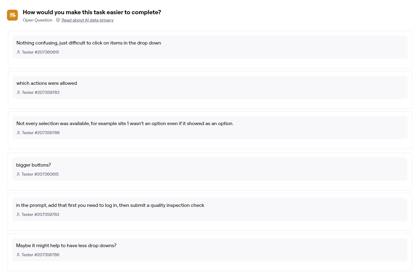
The crucial improvement I would have made involved refining my testing process and presentation to testers. User testing results indicated confusion about tasks (“what is a test”) and frustration with prototype elements unrelated to the task (“I cant click on the placeholder”). In the future, I’ll more thoroughly create the prototype to avoid confusion while also being more specific on the questions I ask in testing.
I also learned valuable lessons in two areas: managing my time and responsibilities as the sole UX designer, and educating the company about my role as a UX designer. Balancing timelines, asking the right questions, and aligning expectations with feasibility for developers were crucial as the sole designer. This also leads to me clarifying the UX design process to management (“think of me as the architect not the construction worker - I’m making a blueprint for your app but not the actual app”).