During the summer of 2021, I worked on a myriad of projects at Kimberly Clark as a UX Design intern. My main projects included recreating the design system for a rebranded Huggies website and redesigning an internal image repository which improved loading times from minutes to seconds. Aside from these I also led an intern-started initiative that increased newsletter open rates by 30%.
1. Performed heuristic evaluations and created new user flows for a remapped internal image repository site in order to solve search/filter efficiency and loading times.
2. Designed, validated, and delivered customer journey maps, information architectures, and a new design system for the development of a rebranded Huggies website.
3. Led an intern-started initiative to AB test newsletters that were receiving hard bounces, which resulted in a 30% increase in email opens nationally.
Over the course of this project, my partner and I revamped an existing photo repository to address various issues flagged by users. Our approach involved collaborative efforts with stakeholders, the development team, and different users across multiple iterations. Despite the constraints limiting user testing, our work resulted in the launch of the site during our tenure at Kimberly Clark. The results were compelling: our designs significantly reduced site loading time from minutes to mere seconds and notably streamlined the process for users to access the required images, significantly reducing the time and steps involved to find what they needed.
What exactly is Content Hub and how does it work?
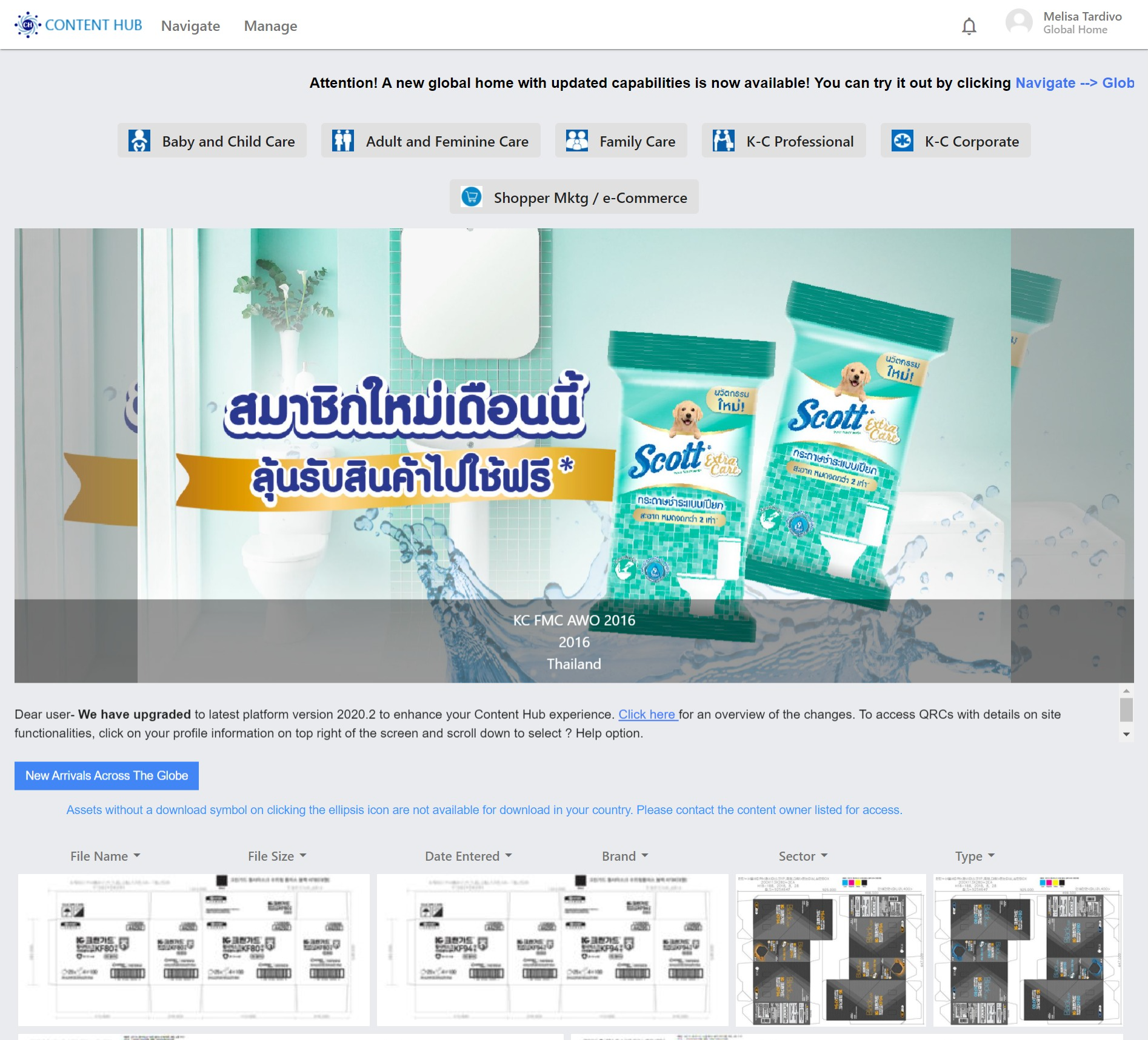
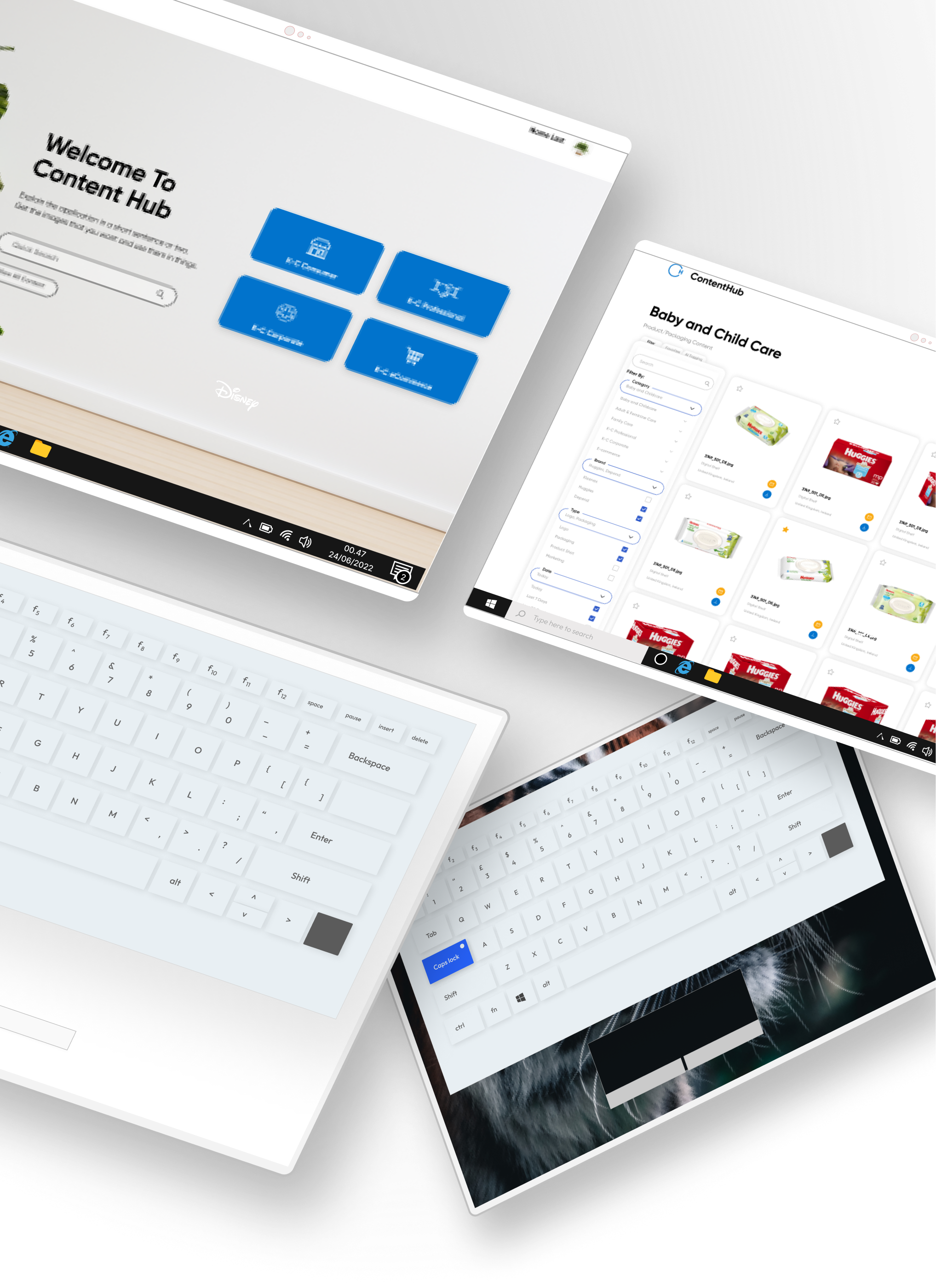
Content hub at its simplest is an image repository for internal Kimberly Clark (here on mentioned as "KCC") employees worldwide. This site hosts images across all sectors, brands, and types internationally.
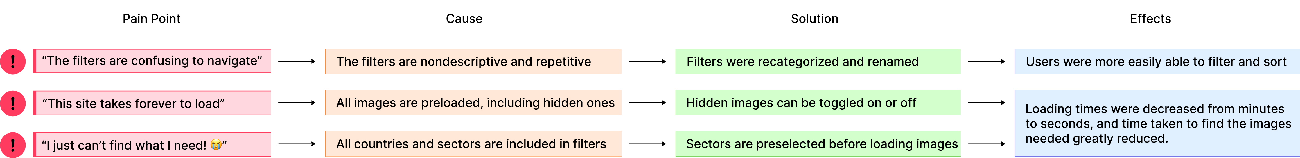
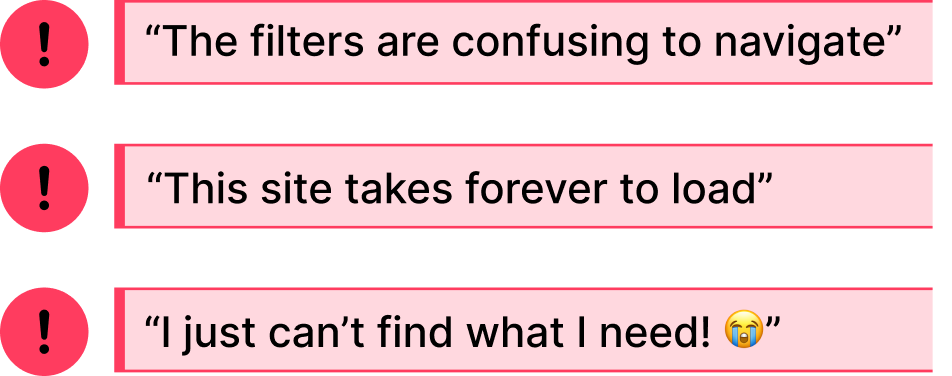
These comments were passed to my partner and I as the top priority "issues" to solve with our redesign. Even from my own observations, these comments were brought up often as remarks and complaints in many design meetings I attended.
Getting an overview of the site flow will help us understand where the problems come from.
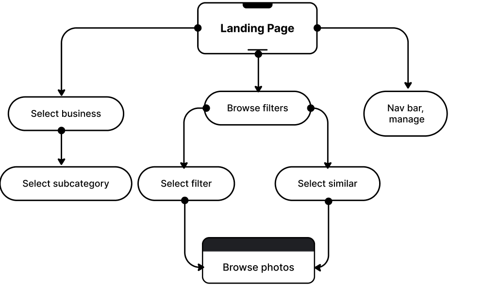
This user flow helps us to understand all possible ways a user can navigate through the image repository after landing on the home page. Though this seems like a working model at a glance, we knew that there wouldn't be complaints if it worked as intended.
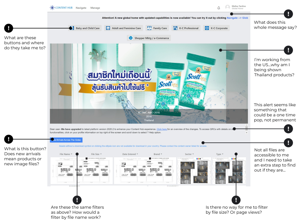
After taking a look at the home site, we made some notes on possible items that may break usual heuristics, keeping in mind this site's typical users: graphic designers, marketing agents, and package designers. Though similar users, the type of content they look for are different. Graphic designers typically looks for assets, marketing agents for photography, and packaging for label prints.
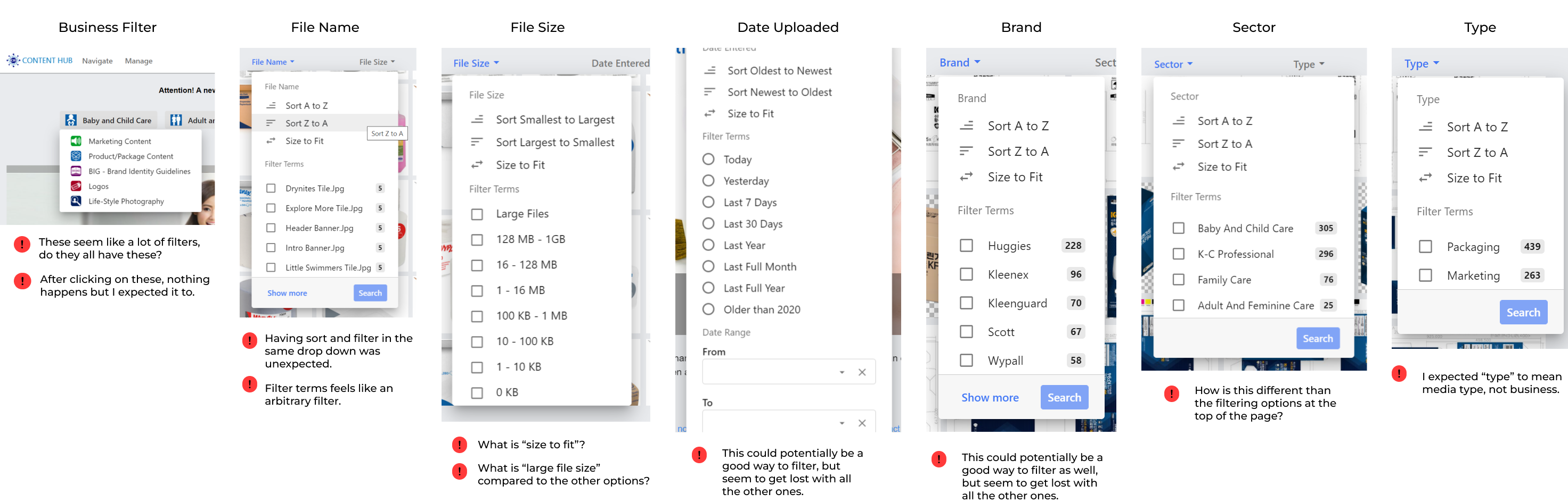
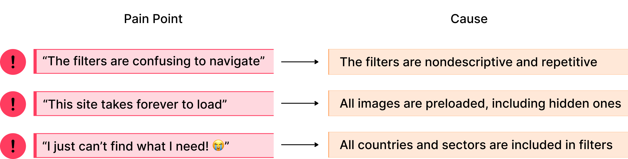
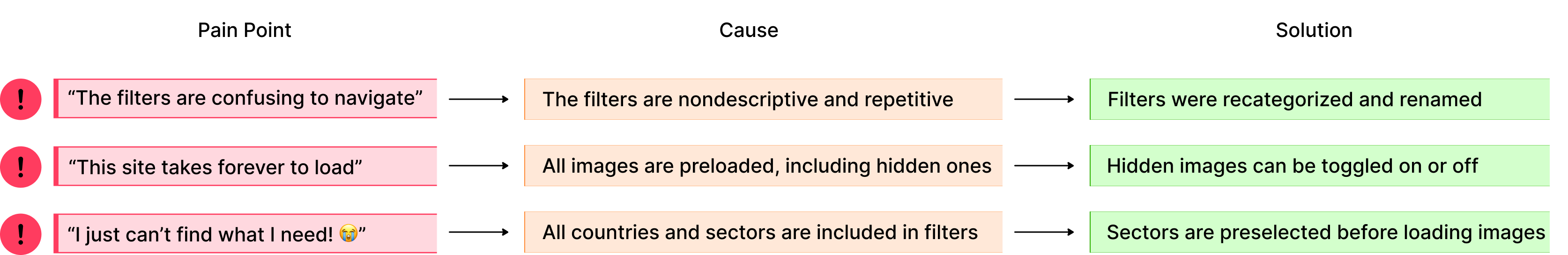
We approached this evaluation from the lens of a typical KCC employee: though they use this site often, they encounter the same problems each time. Therefore, we took note of what could cause frustration in Content Hub's most used assets such as the filter/sort tabs and the photo gallery. After reviewing our comments, we hypothesized three main possible causes:
1. The filters are repetitive, overwhelming or have unclear actions (what does it mean to sort by 'size to fit')?.
2. The site autoloads every image on the page including those that are hidden or region locked, resulting in a monumental initial loading time.
3. When browsing, all images across all countries and sectors are included resulting in an increased number of files to sift through.
After conducting our heuristic evaluations, we came up with some possible causes to the problems we were initially tasked with solving. Though these aren't 100% positive explanations, we decided that these were good enough launching-off points to create our first iteration wireframes. Now that we have goals we can start building towards, our next step was to figure out how to turn these goals into something solid.
What are other image repositories doing?
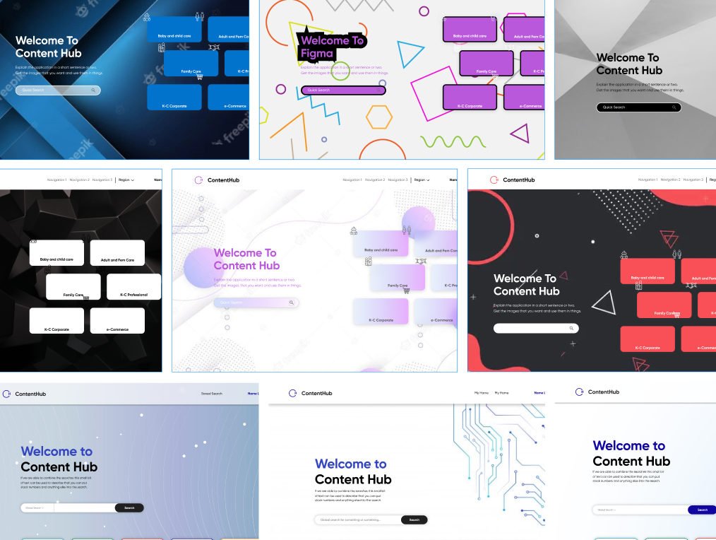
To get an idea of where we should start our redesigns, we looked at sites such as Disney, Dribble, various shopping sites, and even designer portfolios. Our main goal here was to see how they organized large amounts of information and the different approaches they took. This meant either in grids, lists, scrolling galleries, or other unconventional layouts. Here's what we found to be the best "working" points:
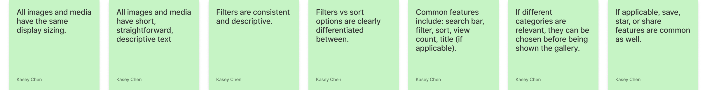
Our goals for this prototype were:
With these points, we drafted our initial prototype to present to stakeholders. While aware that some changes would be dependent on the dev team's capabilities, many updates were made taking into consideration that those changes may not be possible.
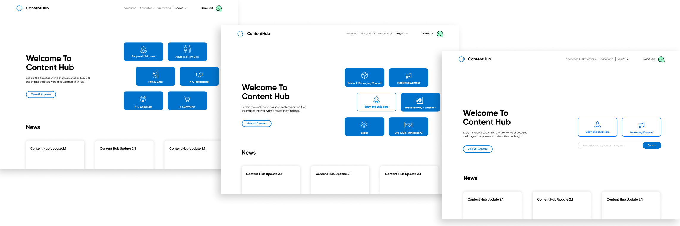
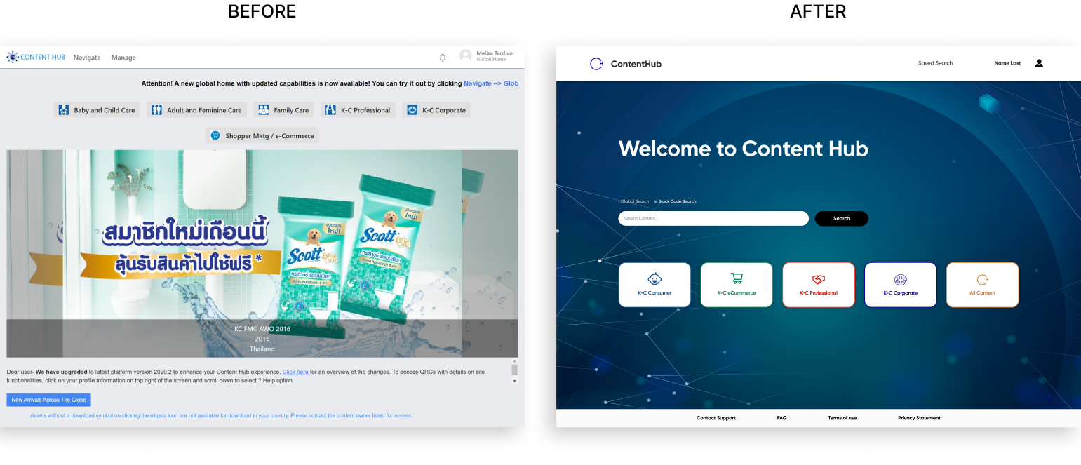
For the updated home screen experience, we changed the landing page to be a short sequence of tiles for the user to choose their correct business sector instead of taking them to the universal gallery as before. This will improve loading times since they will only be shown relevant media to their sector and country. This also removes extra filters from the original home page as these filters will be done before users are shown the gallery. Users will also have an option to go straight to the universal gallery if they chose to do so.
Additionally, we moved news and updates to this landing page instead of having it being shown in the gallery. This way, users will only be shown it once, and it won't take up visual space as they are searching for media.
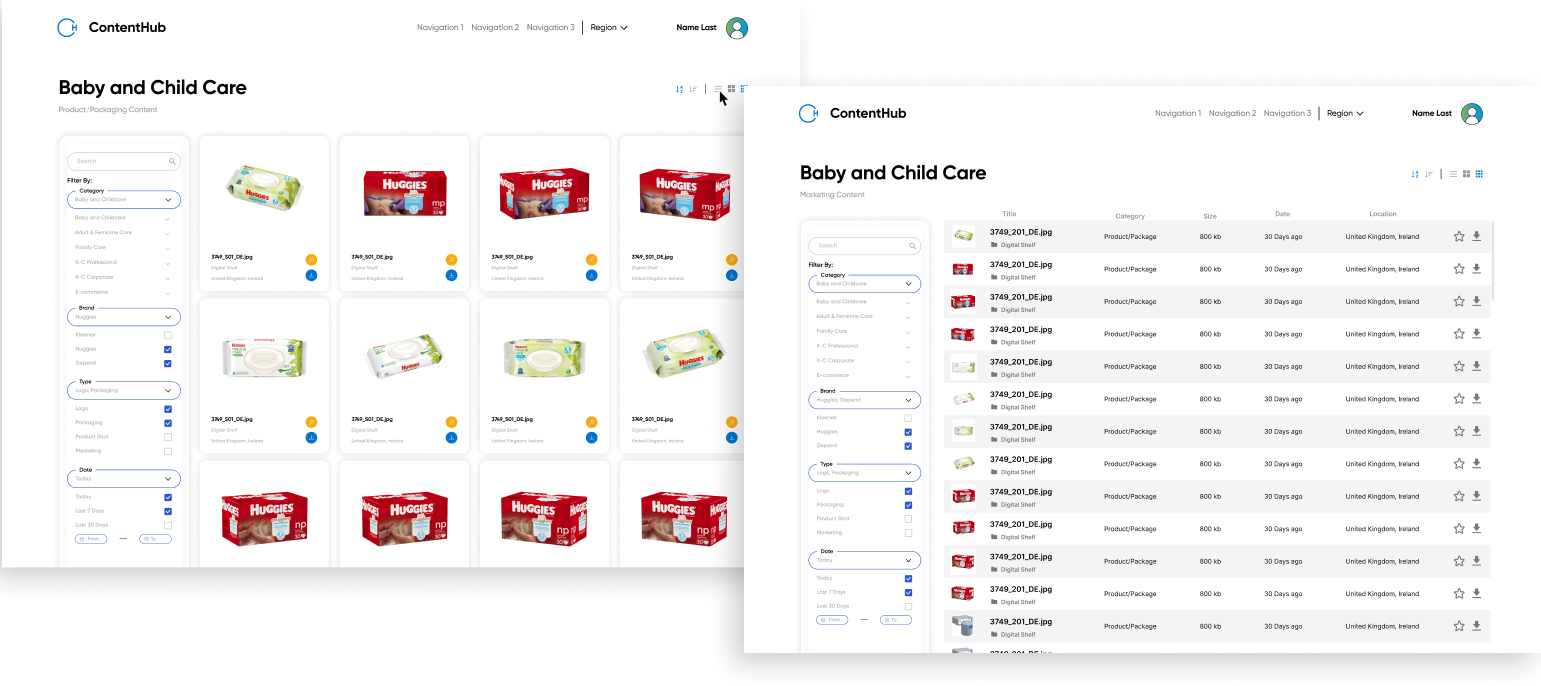
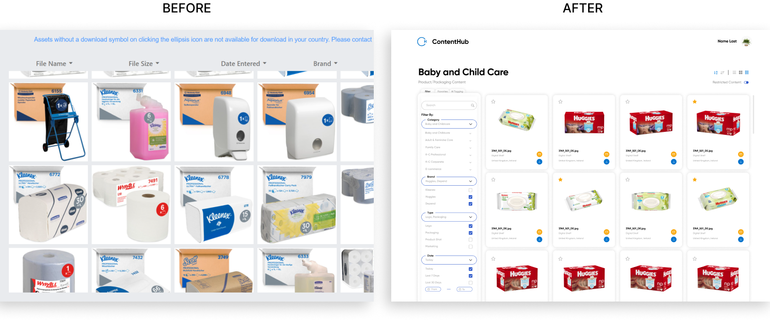
For our gallery view, we made several changes. Filters were simplified and moved to a left column due to the high number of options there were, and a search bar added. Repetitive ones were removed. Grid and list view options were introduced as well as quick sort by alphabetical or date order.
Furthermore, we updated the display boxes itself - we removed hover states so that favorites and downloads could be made right away and made it so that each image uploads to a set dimension instead of to the original ones. Image metadata will largely be hidden unless in list view, and only title, folder, and image size will be shown in grid view.
On the dev side, we made sure to note that hidden images should not be loaded in (determined by country) which would hopefully fix loading times. The initial sector select will also aid in loading times as it narrows down the number of images to be loaded in. Users will still have the ability to switch countries by means of a drop down in a top nav bar.
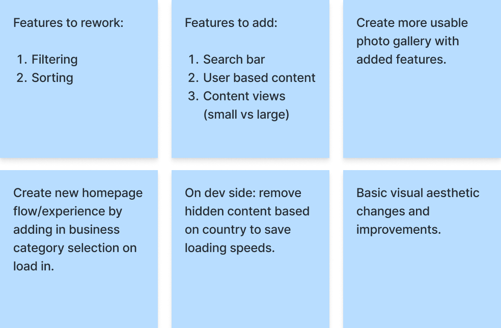
My partner and I presented all the steps we took up until this point to stakeholders, the dev team, our mentor, and a few Content Hub users. We received feedback for each aspect of this design from cost, feasibility, usability, and visual aesthetic. Because UX was fairly new at KCC at the time, we also spent time to carefully explain each design decision, and open conversations to points we disagreed with. To summarize, the main takeaways from this meeting were:
1. The focus of this MVP is the landing/home page sequence, and should be prioritized.
2. The number of tiles on the landing page can be reduced, as the site was updated.
3. There needs to be more color and visuals overall.
Making a site that's both useable and feasible...
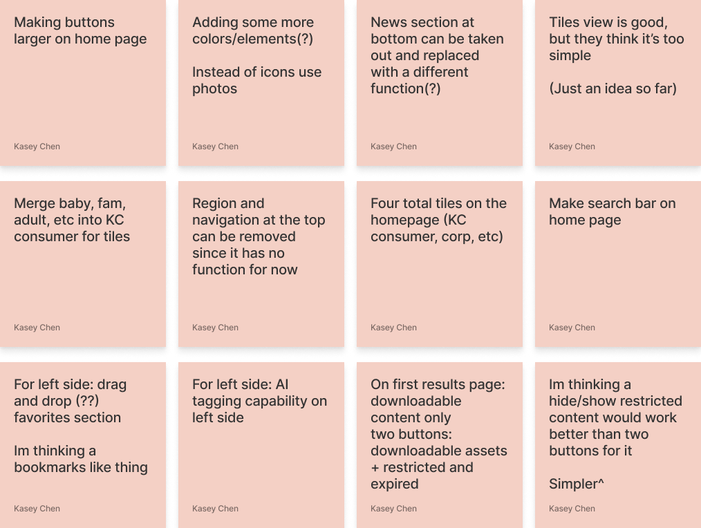
We received unanimous feedback that the landing page should be more colorful and inviting, so we branched off into many artistic directions. However, we ultimately chose to stay on brand with KCC and chose a more neutral scheme to move on with...
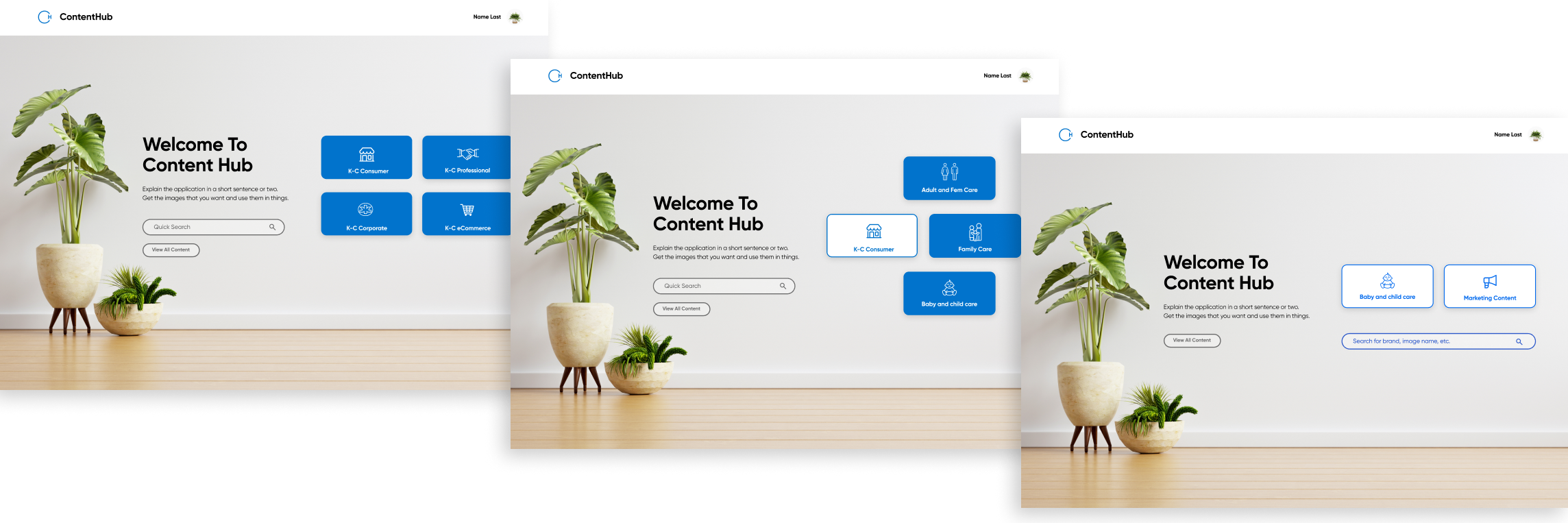
In this second iteration of the landing page, the sector select tiles were reduced from six to three. This was due to the original site being updated as we were working on the previous iteration. This did not affect the sequence of selecting the correct sector then business area.
The background was changed to be an aesthetically inviting interior as feedback was adamant on making "the home page feel more home-y". The navigation bar and news section was removed due to current lack of content, though it was mentioned that it may be added on later.
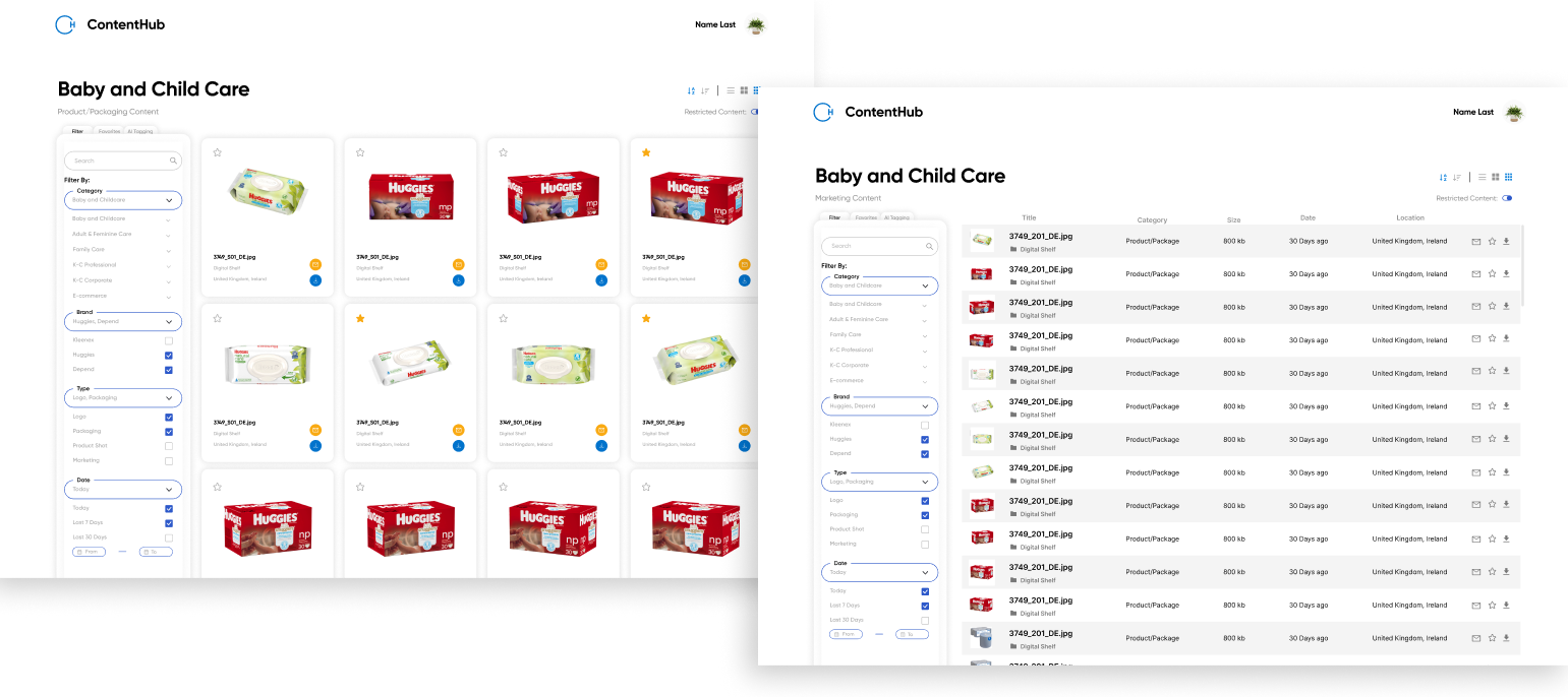
For the gallery page, minimal updates were made. In the left filter column, tabs were added to view favorites and AI tagging. These were features the dev team were currently working on adding, so we took future changes into account. Stakeholders mentioned that they wanted to keep restricted content accessible instead of removed completely so we created a restricted content toggle that allowed users to choose if they wanted access. This way, loading times can still reduced and if toggled on, it will reload with all content shown.

In the second round of our presentations, stakeholders let us know that they wanted to focus on the landing page going forward, and that they wanted to restore some of the previous features they asked us to remove. The site's visual design was heavily discussed, as the stakeholders vision did not align with what the dev and design team had originally agreed to work on. Thus, we decided to create multiple drafts going forward to aid in discussion. The largest changes we were asked to make were:
1. The goal of this project has changed to only the landing page, so the gallery view can be put aside.
2. The landing page format will have to be rethought, as more features are being added back in.
3. Per the stakeholders requests, we need to align the visual branding with their wants.
The biggest challenge for this iteration was finding the balance between user needs and stakeholder wants. Designs that would solve user needs were often pushed aside for visual design choices, so we learned to thoroughly explain why certain decisions were made, and how they affect users. Furthermore, these mock ups would have to be feasible as the development team has a short timeline to be create these sites. We focused on redesigning the landing page with all these constraints in mind.
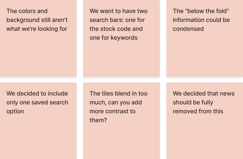
In our third iteration meeting, we received further comments that the colors and background imagery was not what the stakeholders were looking for. Though we provided multiple drafts, they didn't seem to align to the branding they wanted. Thus, we decided to host a longer design working meeting, where we streamed directly in Figma with both the stakeholder and dev team to head towards a compromise. Our main concern was that the page was navigable and easily understood by users (KCC employees). On the other hand, the stakeholders wanted a visually appealing home page and the devs wanted something easily mocked up.
Ultimately, we suggested that we conduct a quick user test with the iterations we have so far so that we can fully understand what "works" and what doesn't. Unfortunately this couldn't be coordinated due to the project timeline coming to a close.
At this point in the project, we were on our final iteration and it didn't seem like we were reaching a consensus on the visual design. My partner and I decided to try and have everyone "zoom out" on the project scope - the main goals of this redesign were to fix the filters, loading times, and to help users find what they needed quickly. Because of this, we worked with the dev team to make it a modular application so that features and styles could be easily swapped out for future iterations.
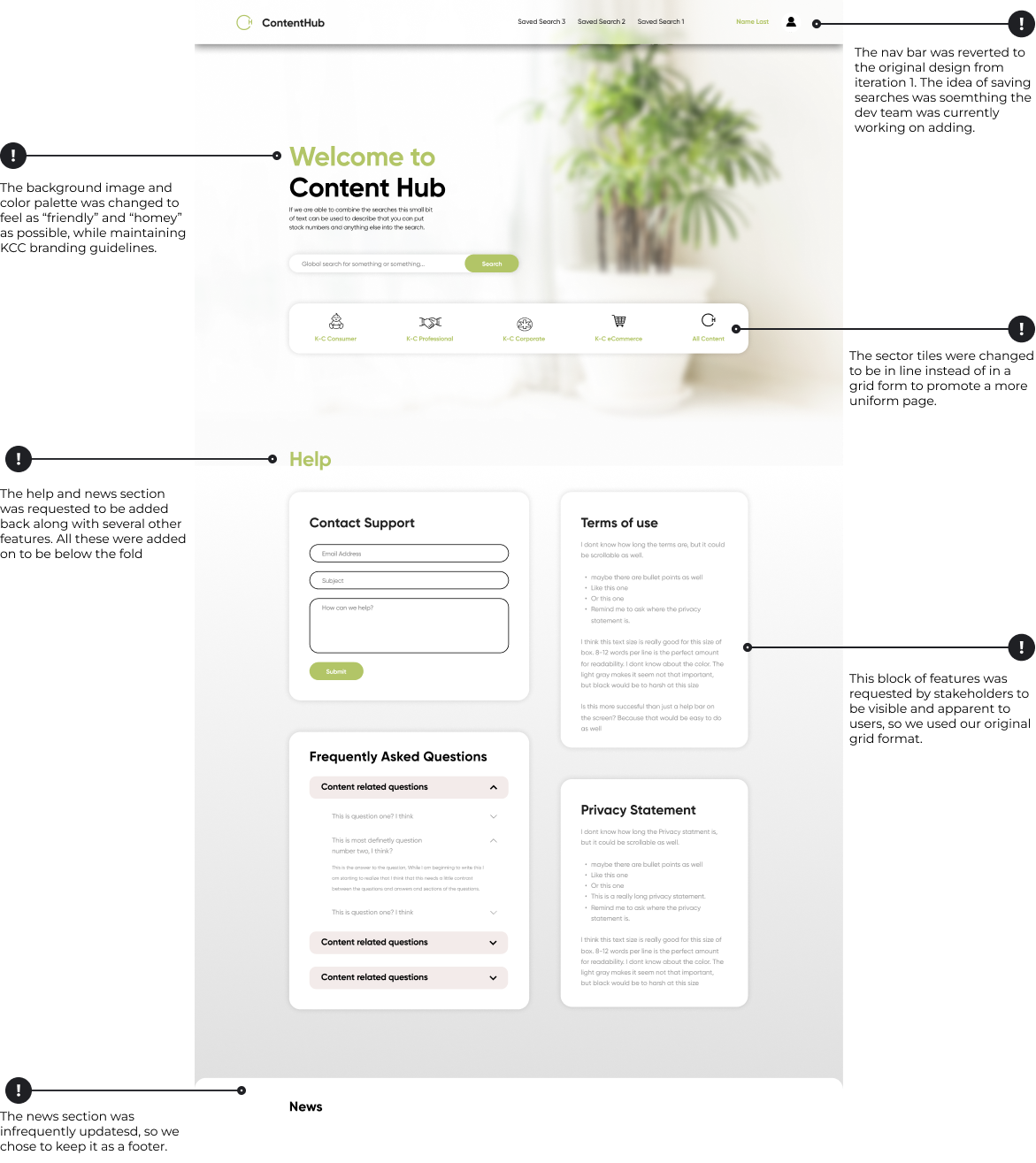
In this final landing page iteration, we chose to include the two categories the user can select before searching, saving visual space. The "below the fold" features from the previous iteration was condensed into a footer, and the tiles individually separated. The tiles itself still work sequentially (select sector, sub category, then it'll take you to the gallery, or direct search). For the background image, we went with one the stakeholders suggested as it can always be changed later.
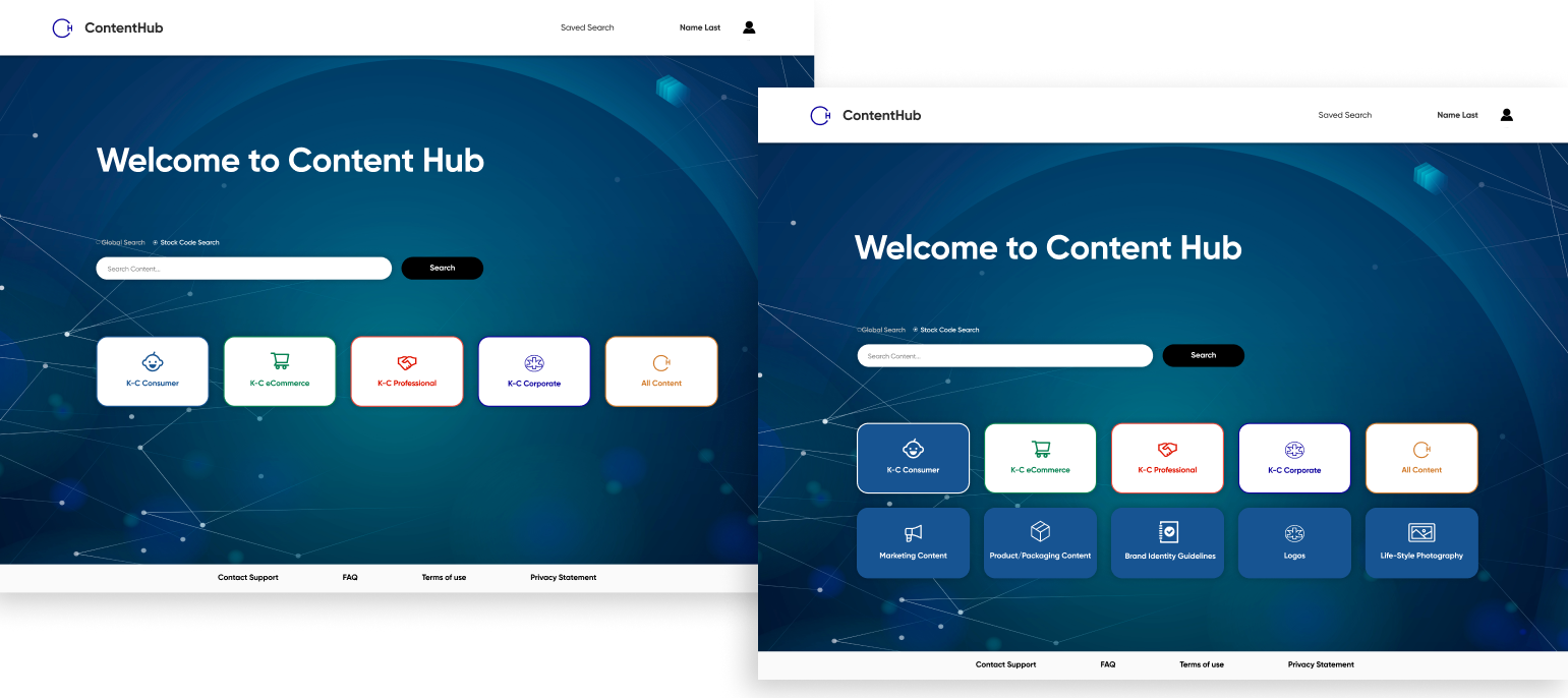
In this final landing page iteration, we chose to include the categories the user can select before searching, saving visual space. The "below the fold" features from the previous iteration was condensed into a footer, and the tiles individually separated. The tiles itself still work sequentially (select sector, sub category, then it'll take you to the gallery, or direct search). For the background image, we went with one the stakeholders suggested as it can always be changed later.
To circle back on our initial goals, we can say that we've provided solutions to the main pain points: confusing filters, slow loading times, and difficulty in finding specific images they needed. Though the gallery page wasn't prioritized in this stage, our redesigned were archived for the next round of designers to work on. However, due to this we can't definitively say that all pain points were solved since we lacked time to properly user test the final iteration.
Throughout this project, my partner and I had to redesign an existing photo repository to fix several pain points users have been bringing up for an extended period of time. To do this, we worked closely with stakeholders, the development team, and some users to work through several iterations. Though we were unable to thoroughly user test the site, it was launched during our time at Kimberly Clark and we found that our designs had decreased site loading time from minutes to just seconds, and that the time/steps it took users to find the images they needed were drastically reduced.
This project also proved to be a great exercise in communicating between teams, and working with shifting constraints. Many times throughout this project, we either found ourselves or other teams getting too caught up in the details - pixel perfect alignment, color palettes, and visuals. Though these are important features to perfect, our main goal was to aid users. Thus, I learned a lot on consolidating stakeholder vs user needs and how to communicate design decisions to different teams.